I had so much fun planning and decorating the gender neutral safari nursery for our newest family member, although it wasn’t without its challenges. If you have been following us for a while now you will know we decided not to find out the gender of our baby while I was pregnant. Designing a gender neutral nursery was hard for me. I had so many ideas floating around my head for beautiful nurseries, but all were very gender-specific.
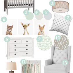
A few months ago I designed a mood board to help collect all of my ideas for designing the perfect nursery for our sweet baby. This really helped me to narrow down exactly what I was looking for so I didn’t get overwhelmed or over-buy while shopping for the nursery (a big problem for me!).
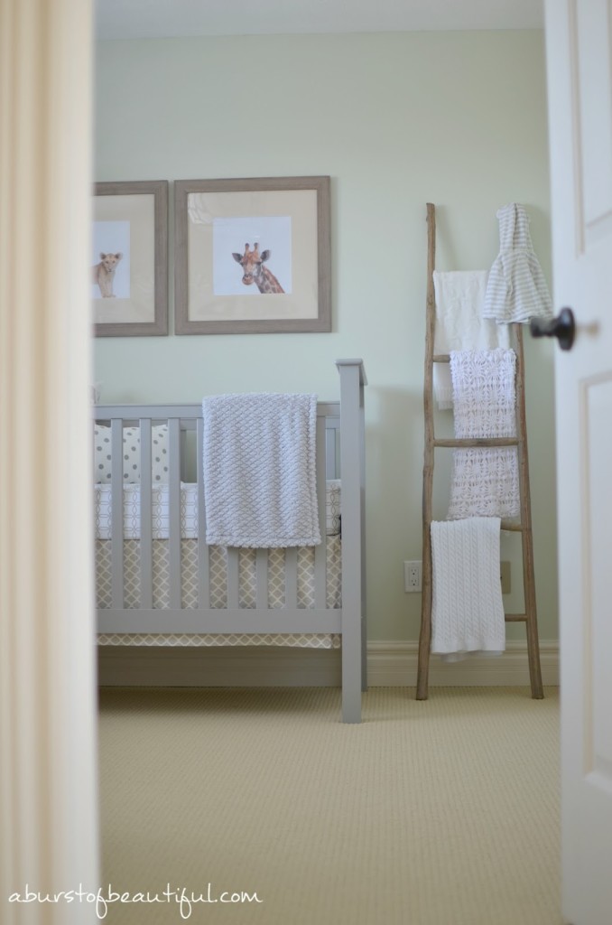
The first step was deciding what colour to paint the nursery. I struggled with this for weeks! I knew what colour I wanted, but I had such a hard time actually finding it. After countless paint samples I found exactly what I was looking for. Sweet Celadon by Benjamin Moore is the perfect colour for a sweet nursery.
I was originally leaning towards a woodland theme, but Nick was quick to point out mostly every room in our house has some type of “woodland” animal hanging out in it. So we decided to change routes from woodland to safari. I wanted a subtle theme to help keep the room cohesive. Nothing over the top, just a few sweet details to give the room personality. These details will be easy to switch out as our baby grows.
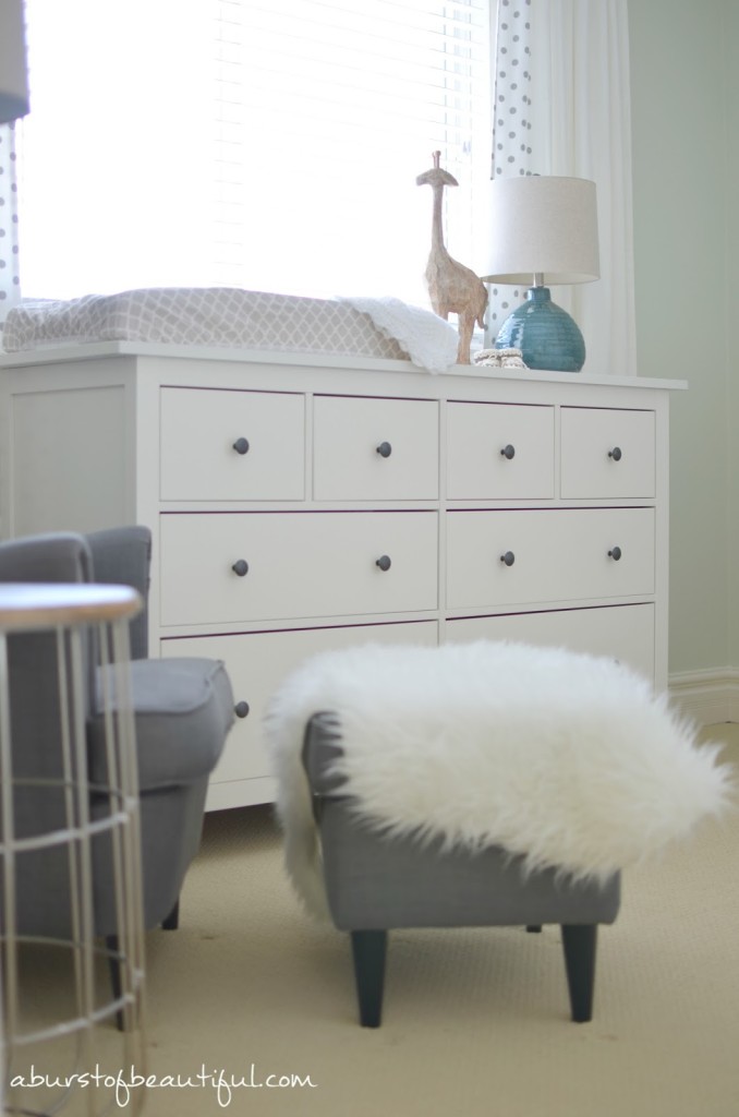
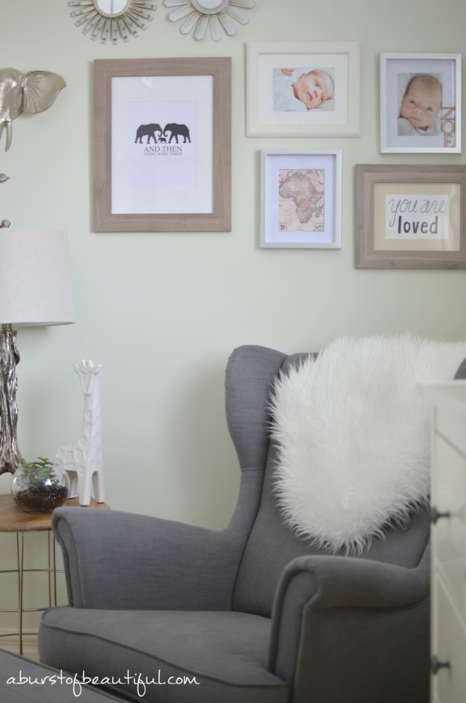
I was careful in choosing furniture for the nursery, knowing these pieces will be with our family for years to come. I chose key pieces in neutral colours with classic lines that I know I won’t tire of. The grey wing chair and stool are from Ikea. I have been drooling over this chair for at least a year now, but we didn’t really have space for it in our home, until now. It’s the perfect chair for a nursery, comfy, roomy and the high arms are perfect for helping cradle baby to sleep.
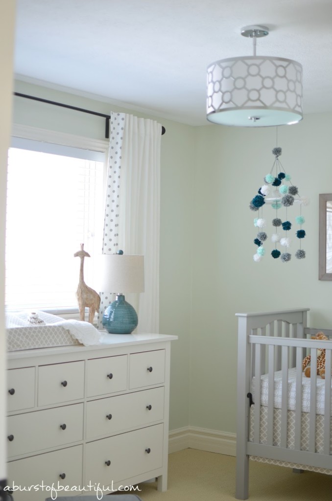
The dresser is also from Ikea. It is part of their Hemnes line, which I’m completely in love with. We have so many pieces of Hemnes furniture throughout our house, I love that they can all work together or separately depending on our needs (and space) at any particular time.
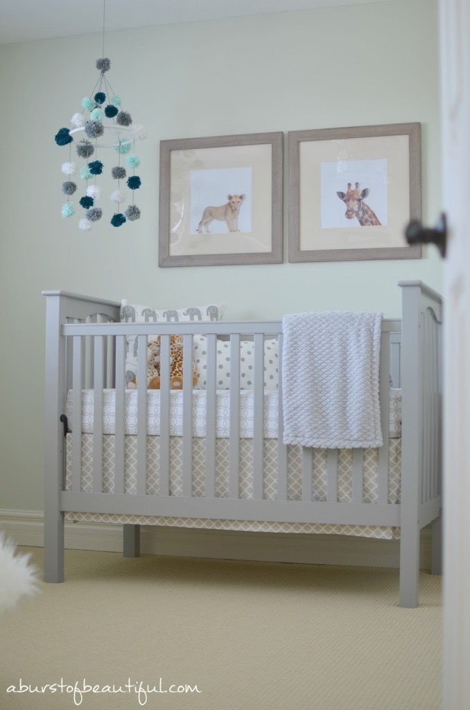
The crib is from Pottery Barn Kids. They have the most beautiful furniture. I spent hours pouring over every crib, dresser and change table on their website and in their stores. I knew we needed a crib that would last for future children, so it had to be sturdy and classic. I fell in love with the clean lines and simplicity of the Kendall crib. And it was after a lot of deliberation that I finally decided on the grey finish. I almost fell back on my tried and true colour, white, but I loved how the grey gave it a little more personality.
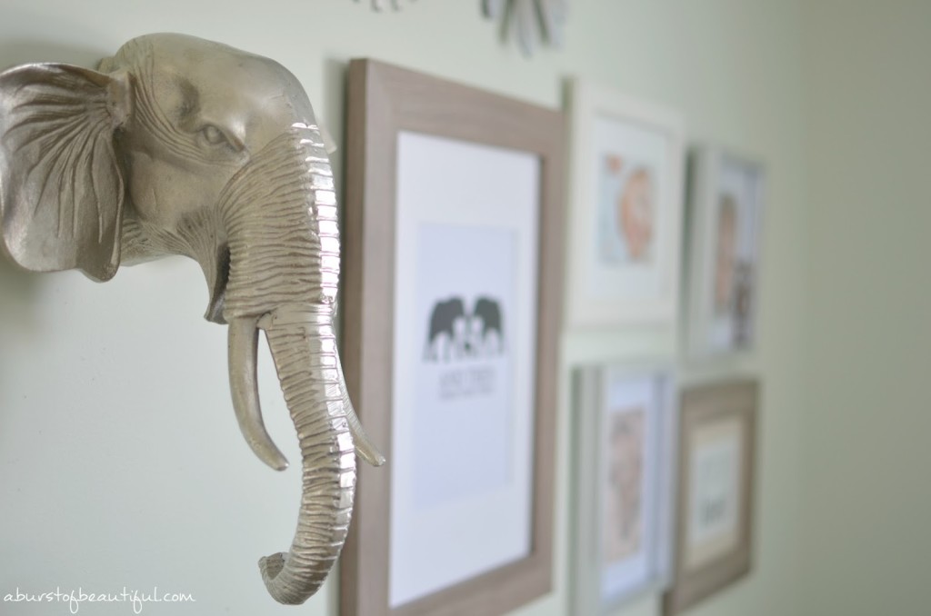
Next came art for the walls! We love photography, so we knew we wanted to add a gallery wall to showcase all of the adorable photos we would be taking of our new baby. We mixed photos with graphic prints, mirrors and a charming elephant head to create an interesting focal point in the room.
Nick created all of the prints for the nursery. This was a big budget-saver for us!
Once the big decisions were out of the way it was time to have fun with the little touches, adding some much needed charm and character. A lot of the pieces in the room are DIY projects that Nick and I worked on. These helped us to save on costs and let us add those extra special touches to make it our own.
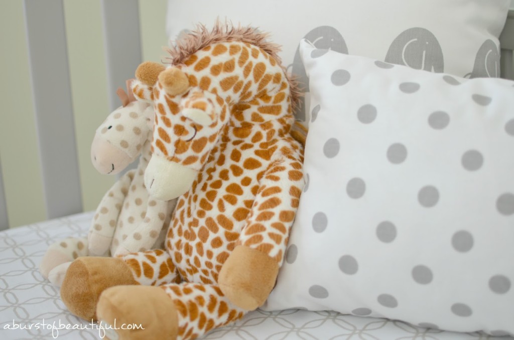
I found some adorable grey and white polka dot and elephant print fabric from my favourite fabric store, which was perfect for a few handmade pillows. It was a fun afternoon project for my mom and I! You can read how we made them here.
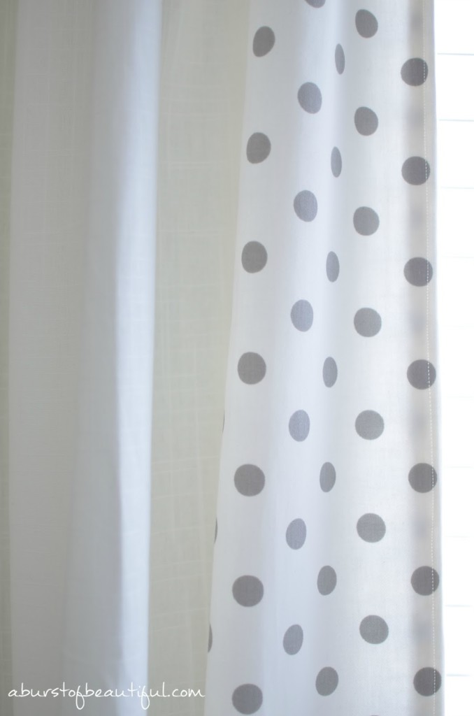
I started with basic white curtain panels from Ikea (these are another favourite of mine, I have them in basically every room of our house), but I wanted something a little more fun for the nursery. I had a lot of the grey and white polka dot fabric left over (I bought a ton because I’m a sucker for anything polka dot), so we simply sewed strips on either side of the curtain panels as trim.
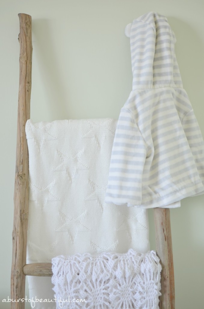
We looked for decor that fit with our safari theme, but still had a very neutral feel to it. We stuck to a grey and white colour palette with hints of natural wood thrown in. I layered in a lot of different textures, like knits, wools and faux fur, to add warmth to the room.
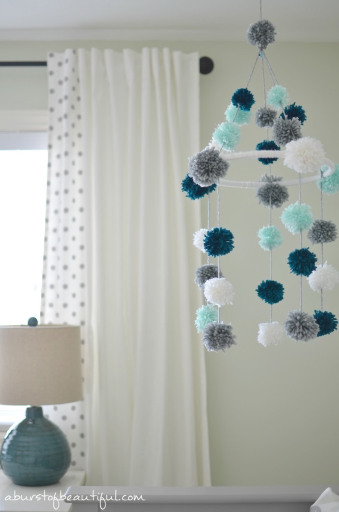
One of the last projects I worked on for the nursery was the mobile. There are so many adorable options out there that I had a hard time deciding what I wanted. In the end I saw a mobile from The Cross made out of pom-poms and I fell in love with it. It was so different and so fun! Plus I had been wanting to try out a pom-pom project of my own since Christmas. It was a time consuming project, but I’m so happy with how it turned out. I’ll be sharing how I made it on the blog in the next few weeks.
So that’s our sweet gender neutral nursery! It’s such a calm and happy space, full of pieces we love and projects that we made ourselves. It’s the perfect room for our sweet baby girl.
Sources:
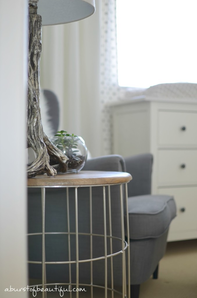
- Metal and wood side table – HomeSense
- Tree trunk lamp – HomeSense
- Succulent terrarium – DIY Project
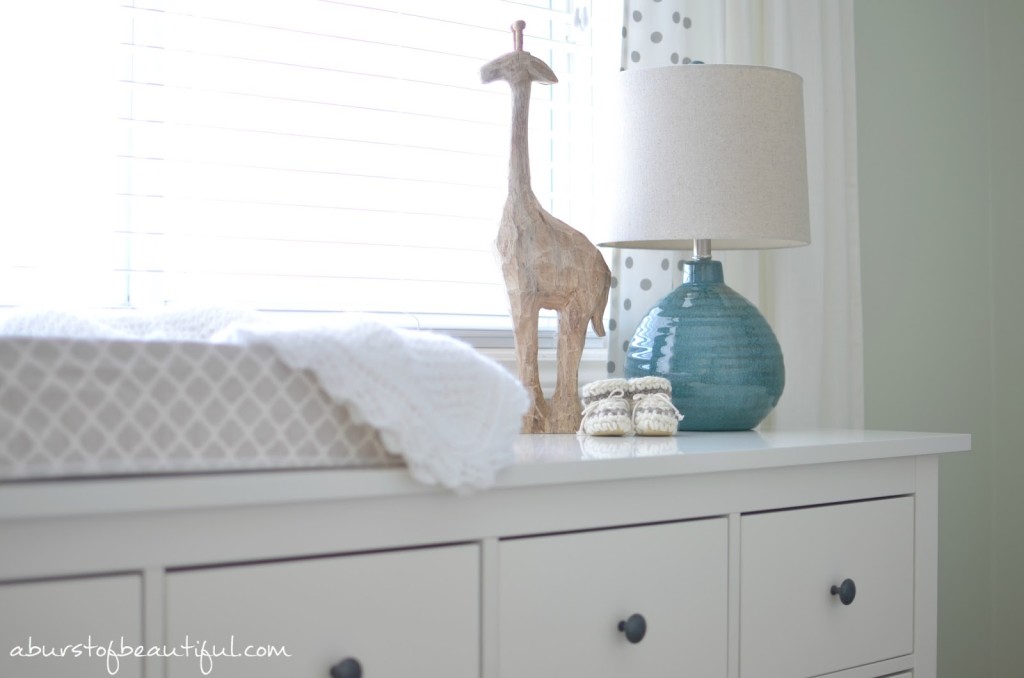
- Ceramic giraffe – HomeSense
- Wood and white picture frames – Ikea
- Silver picture frames – Dollarama
- Elephant head – HomeSense
- Sunburst mirrors – HomeSense
- Wing-back chair and foot stool – Ikea
- Faux fur throw – Ikea
- Dresser – Ikea
- Change pad cover – Ben & Noa
- Wood giraffe – HomeSense
- Knit booties – Source unknown (gift)
- Turquoise lamp – HomeSense
- Curtains – Ikea
- Polka dot and elephant fabric – Tonic Living
- Crib – Pottery Barn Kids
- Crib sheet – Living Textiles
- Crib skirt – Ben & Noa
- Mobile – DIY Project (tutorial coming soon!)
- Ladder – Barebirch
- White and cream wool blankets – HomeSense
- White knit blankets – Handmade (gifts)
- Grey fleece blanket – HomeSense
- Prints – DIY Projects
- Paint – Sweet Celadon Benjamin Moore



Priscilla says
where did you get the chandiler?
Alicia says
Hi Priscilla, we purchased it from a local store. However, I believe Home Depot carries a similar style.
Amanda says
How did you do the 2 prints of the giraffe and lion? This is just what I am trying to do?
Alicia says
Hi Amanda, we found stock images online that were available for personal use and printed them on glossy photo paper and simply cut out the animal and mounted it to a matte cardstock before adding it to our frames. I hope that helps!
Brooke says
I love your style! Just came across this post while searching for ideas for our first nursery. I’m wondering how you like the chair now, and if you ever wished you had gotten more of a rocker? I love the idea of picking a functioning piece of furniture for years to come, but worry I’ll regret not getting something that rocks.
Alicia says
Hi Brooke,
Thank you for your sweet message, and congratulations on your first little one, I hope your pregnancy is going well. 🙂 We still really love the wingback chair from Ikea. It has held up really well, and it’s perfect for cuddles and story time as our daughter grows. I didn’t once regret not getting a rocking chair, but I think that really depends on your baby. Some babies love to be rocked, and other’s are content without. The nice thing about choosing an occasional chair is if you end up deciding you want a rocker in the nursery, you can simply move the chair to another room in your home and still get plenty of use out of it. I hope that helps!
Alicia xo
paige says
did you use the taupe bed skirt or gray?
Alicia says
Hi Paige, the crib skirt we chose was taupe!
Krista @ Stork Wares says
The whole nursery is adorable! Thank you for the pom pom mobile tutorial, it’s on my growing list of DIY projects 🙂
Alicia says
Thank you, Krista! So glad you enjoyed the post. I hope you have fun making a pom pom mobile of your own!