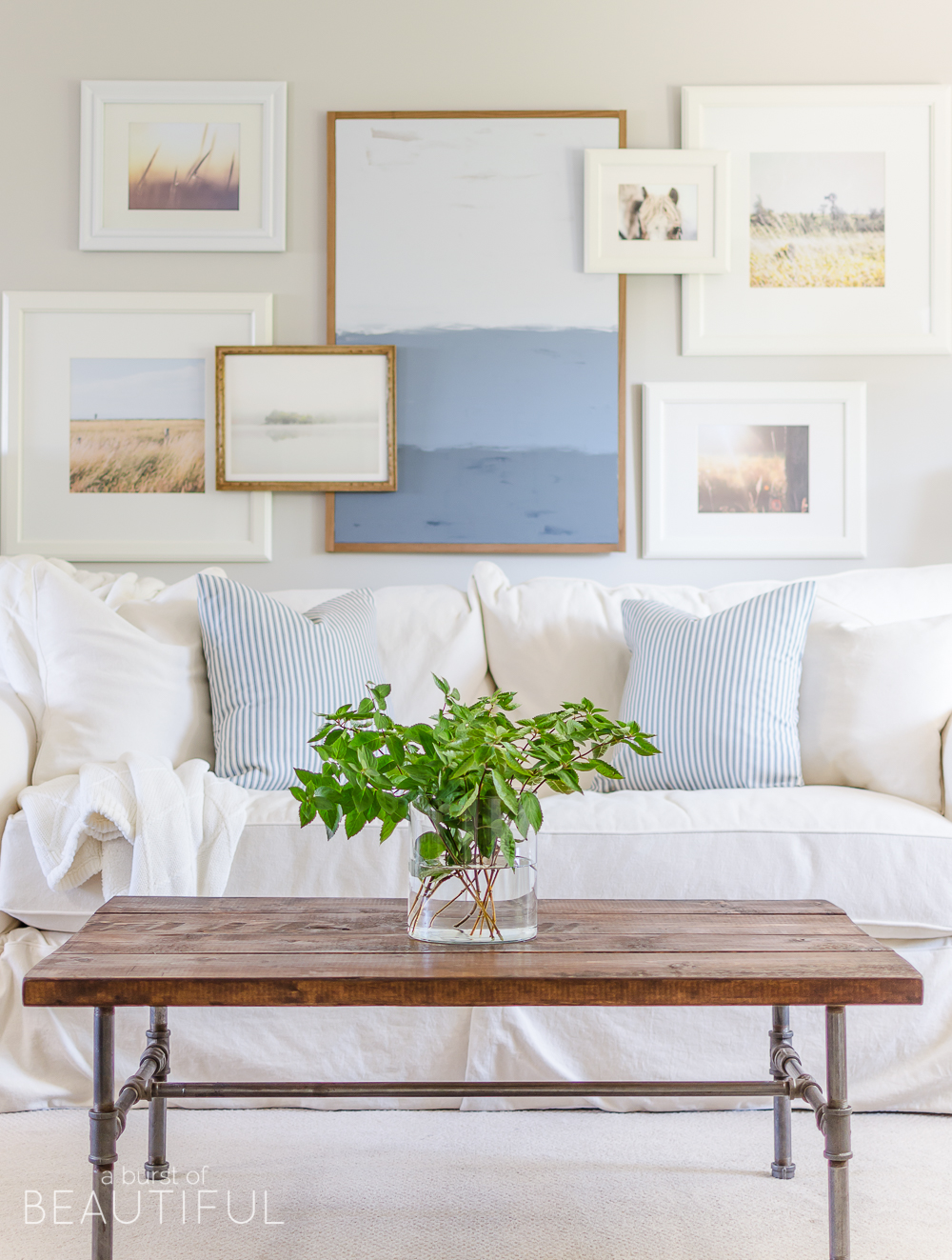
We have been so completely overwhelmed by the sweet and thoughtful comments so many of you have shared with us since revealing the updates we made to our living room a few weeks ago. But by far the most interest has been directed at our new gallery wall.
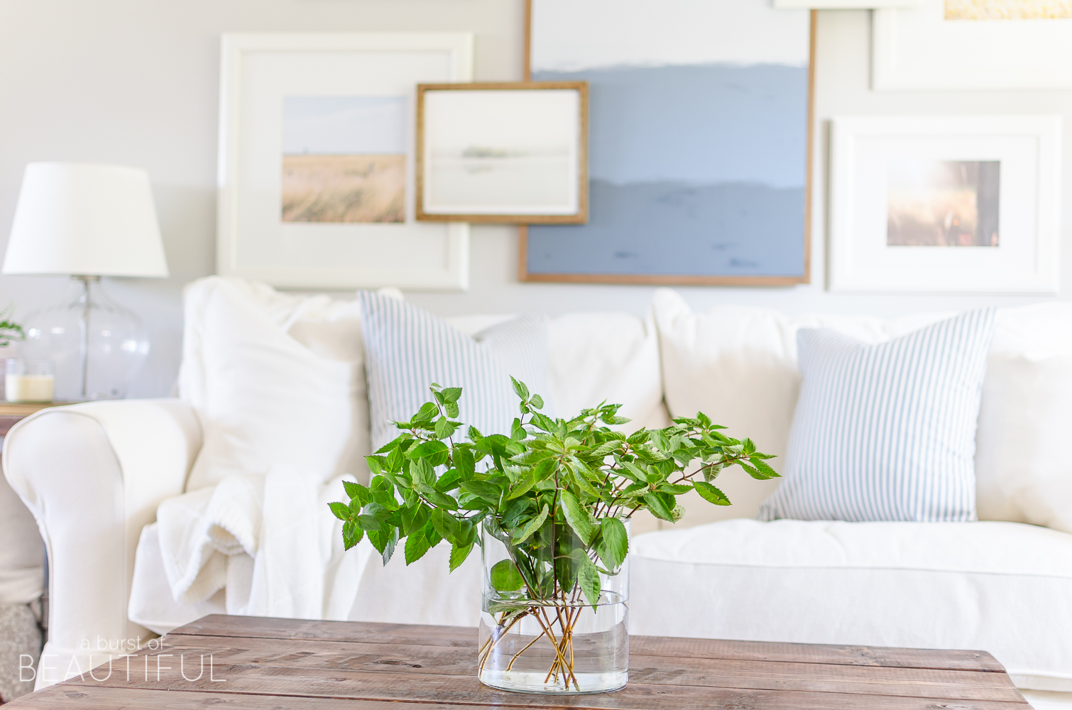
We’ve received so many questions about both the art we used and how we hung the prints that I wanted to share with all of you just how we did it.
Our living room makeover began simply because we decided it was time for a few adjustments to our main living space, I won’t get into it again, but you can read all about it here if you want to catch up. Creating a better flow from room to room was a must and so we decided the best place for our new sofa was against the only solid wall in our living room, which then led to the question of what to hang above it.
I debated between a collection of vintage mirrors, one large piece of art or a gallery wall. I liked all of these ideas, but I absolute love the look of a well-curated gallery wall and thought it would be fun to try something a little different in our space. I certainly didn’t invent the idea of the layered gallery, this look has been around for quite some time, and I was so inspired by this beautiful collection here, that I decided this was definitely the look I wanted to play with in our new living room.
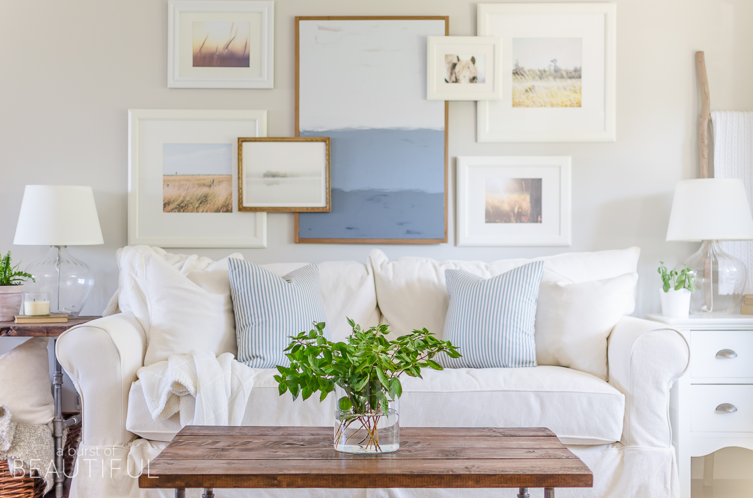
I began by settling on a color palette. When I started this room makeover I knew I wanted to incorporate soft blues into the mix to add a little bit of color and interest to the mostly white palette, and so I began collecting prints that fell within this color range. I also wanted to carry through the use of white and natural wood elements and I did this with the frames we used. This helps to keep a feeling of cohesiveness and consistency.
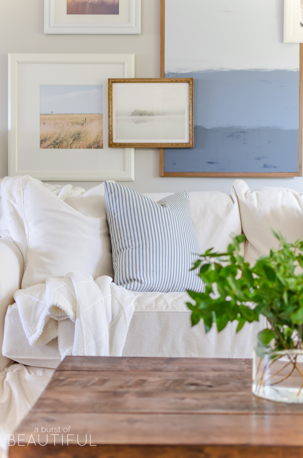
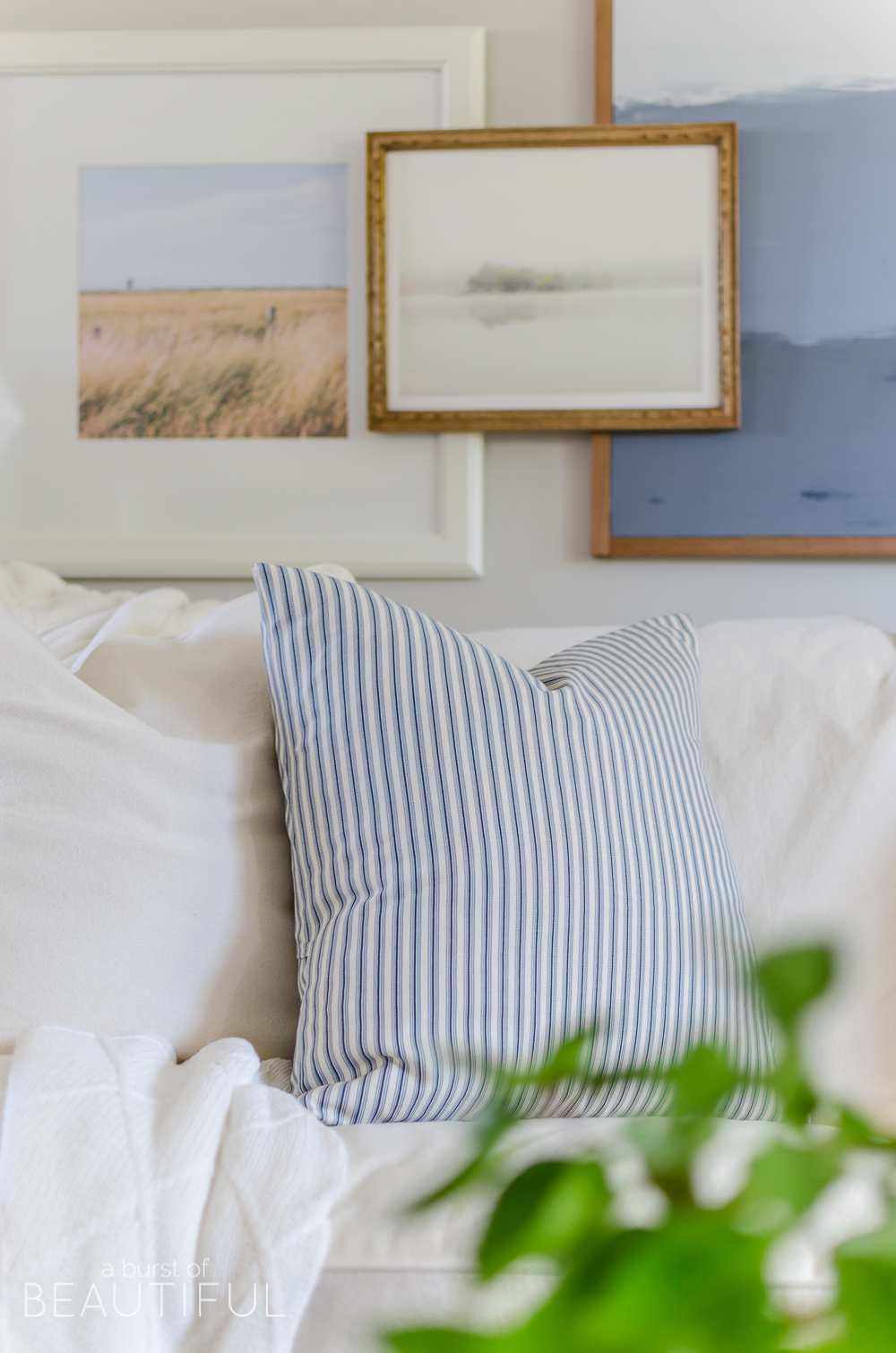
Choosing art for your collection shouldn’t be a quick process. Take your time to choose pieces that speak to you and that have a story to tell. If you’re having a hard time finding pieces like this, it’s OK to use generic prints as placeholders until you find just the right piece. I fell in love with these two prints here and here, but used generic stock images for the rest of the prints until I can find something I love even more. A well-curated gallery wall should grow and change with you and your space.
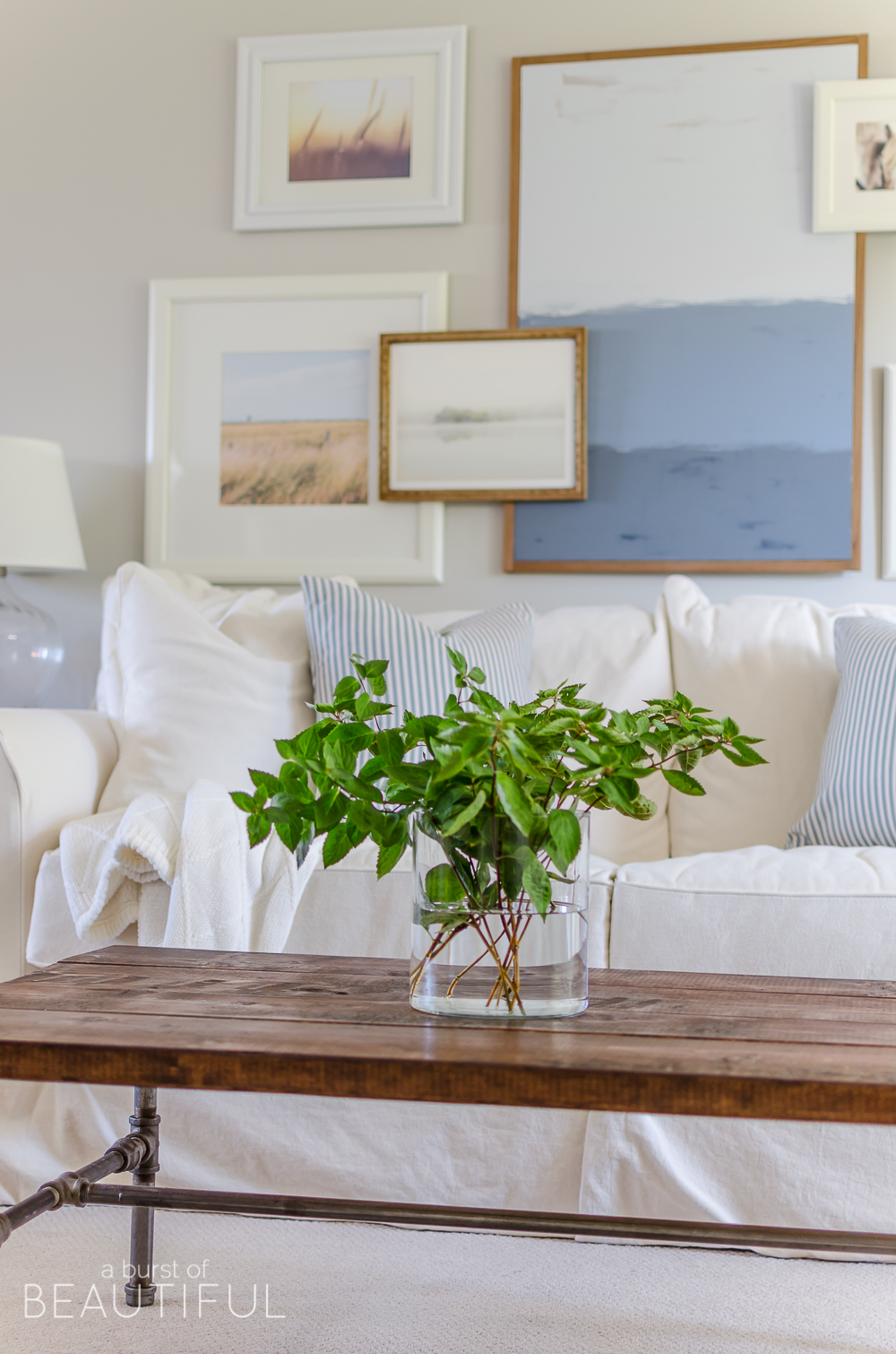
I also knew I needed a large feature piece to take center stage. I think one of the easiest ways to add interest and depth to a gallery wall is by mixing media. I decided that I wanted some type of abstract painting for my big art piece and this is also where the majority of color comes into play. But large pieces of art can be expensive, so I got creative and painted this easy DIY abstract art. It truly was so easy to do and I love the way it turned out!
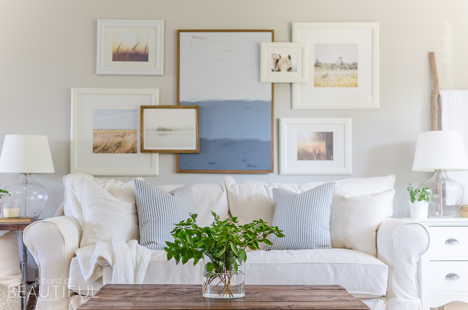
Nick built a basic frame around it, which I think really helps to create a finished look and I love the texture the natural wood adds. We will be sharing all about this project in another tutorial in the coming weeks.
Once we had all of the pieces we wanted to include, it was time to hang our gallery wall. We traced the frames onto paper and taped these to the wall, moving them around until we created a layout we were happy with.
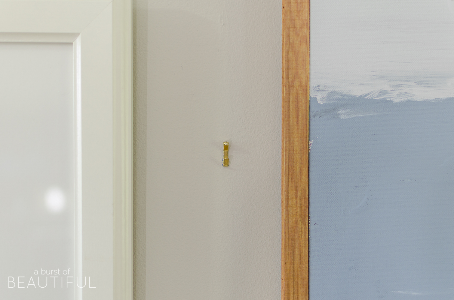
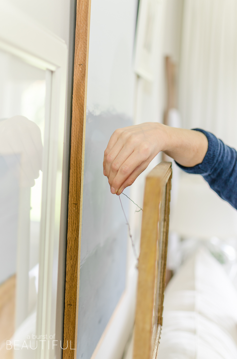
Creating the layered look is very simple. We added a length of picture wire to the back of the frames that we wanted to sit out further than the rest and mounted them on regular picture hooks attached to the wall. The picture wire allows for a little extra slack which allows the picture to sit out further from the wall and rest on the frames behind it, for that layered look. That’s all there is to it, no special tricks or fancy appliances. You’ll want to make sure that the two frames the top photo sits on are relatively the same depth.
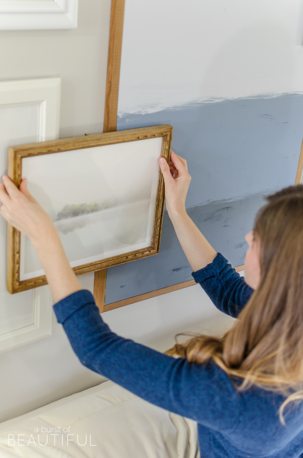
I absolutely love the dimension and interest that a layered gallery wall creates, don’t you? I think it is just what our living room needed.
Have a beautiful day!
Alicia xo
sources
- Wall color – Collingwood by Benjamin Moore
- Sofa – Joss & Main
- Navy and cream ticking stripe pillows – Studio Pillows
- Cream pillows – HomeSense / HomeGoods (similar)
- Knit Throw – HomeSense / HomeGoods (similar)
- Industrial pipe side table – Tutorial
- Glass lamps – Ikea (similar)
- White frames – Ikea
- Island print – Minted
- Horse print – Minted
- Abstract painting – Tutorial (coming soon)
- Blanket ladder – Barebirch (similar)
- Coffee Table – Tutorial


Stephanie Trombino says
Hi! I love your gallery wall so much! Did you do a tutorial of the abstract large painting? I can’t seem to find it on your blog 🙁
Alicia says
Thank you, Stephanie! I didn’t do a tutorial because at the time there were a lot of tutorials already available. It was very easy though, I just chose three colours and used a paintbrush to paint sections of the canvas. Just have fun and be creative!