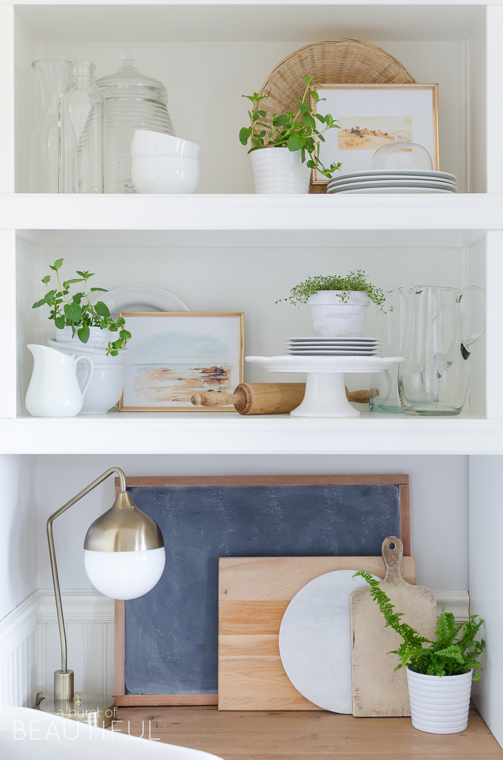
I had so much fun styling and shooting today’s post, but I wouldn’t always have loved it so much.
A few years ago, and consequently when I first started blogging, I wasn’t very good at styling shelves…of any kind. I found it overwhelming and difficult to create a visually appealing and cohesive look. But just like any other skill I’ve wanted to improve, I’ve taken the time to learn what works and what doesn’t and how to perfect my technique as best I can (and just like any other skill, I am still learning and always will be).
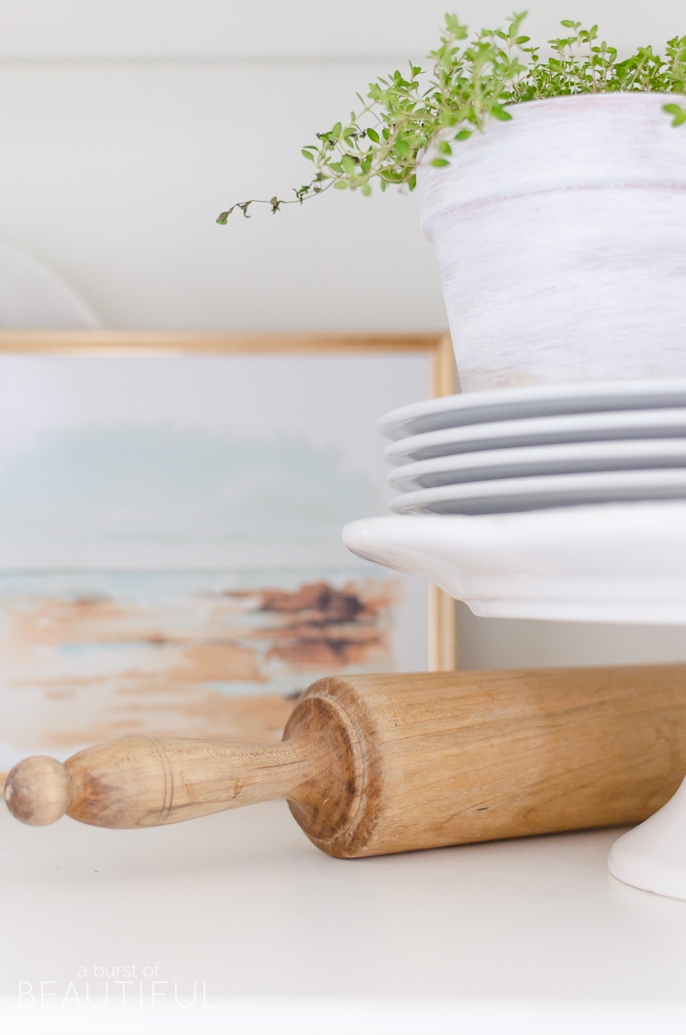
I studied what others were doing, in magazines, on blogs, and throughout my favorite interior design shows, and slowly I got better. Now, like I said, I’m still not perfect and never will be, but that’s the fun in learning a new skill…there is always room to improve.
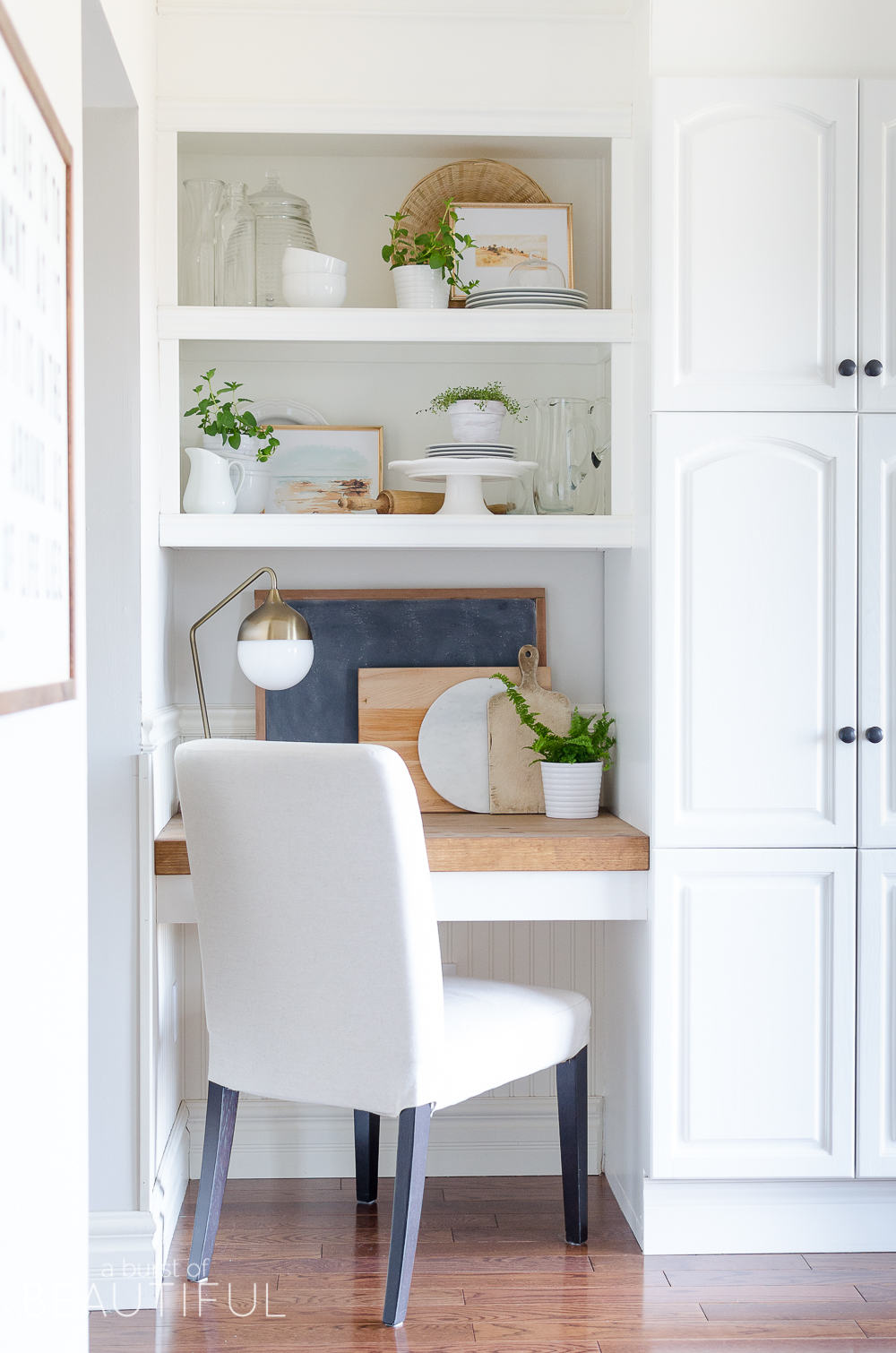
These beautiful open shelves in our kitchen get a lot of love, especially on Instagram. My husband is one talented guy and I have to say, this little nook in our kitchen is one of my favorite visions he has brought to life for me. You can read all about how we updated our tired kitchen here, and how we completed the look by adding these practical floating desks under the shelves.
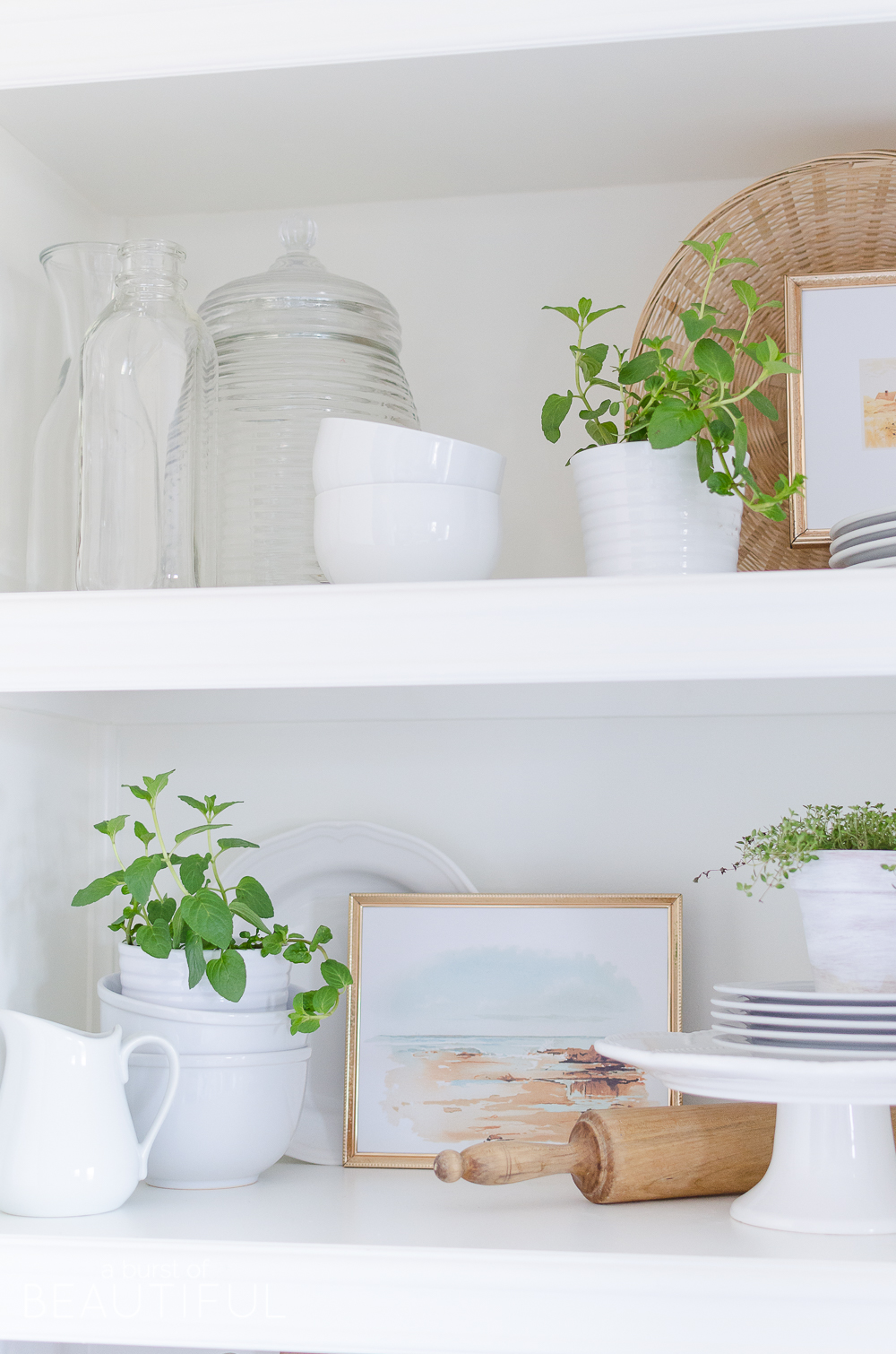
So I wanted to take some time to share what I’ve learned along the way, and I hope this helps those of you asking about our kitchen built-ins and how we go about getting that modern farmhouse look…
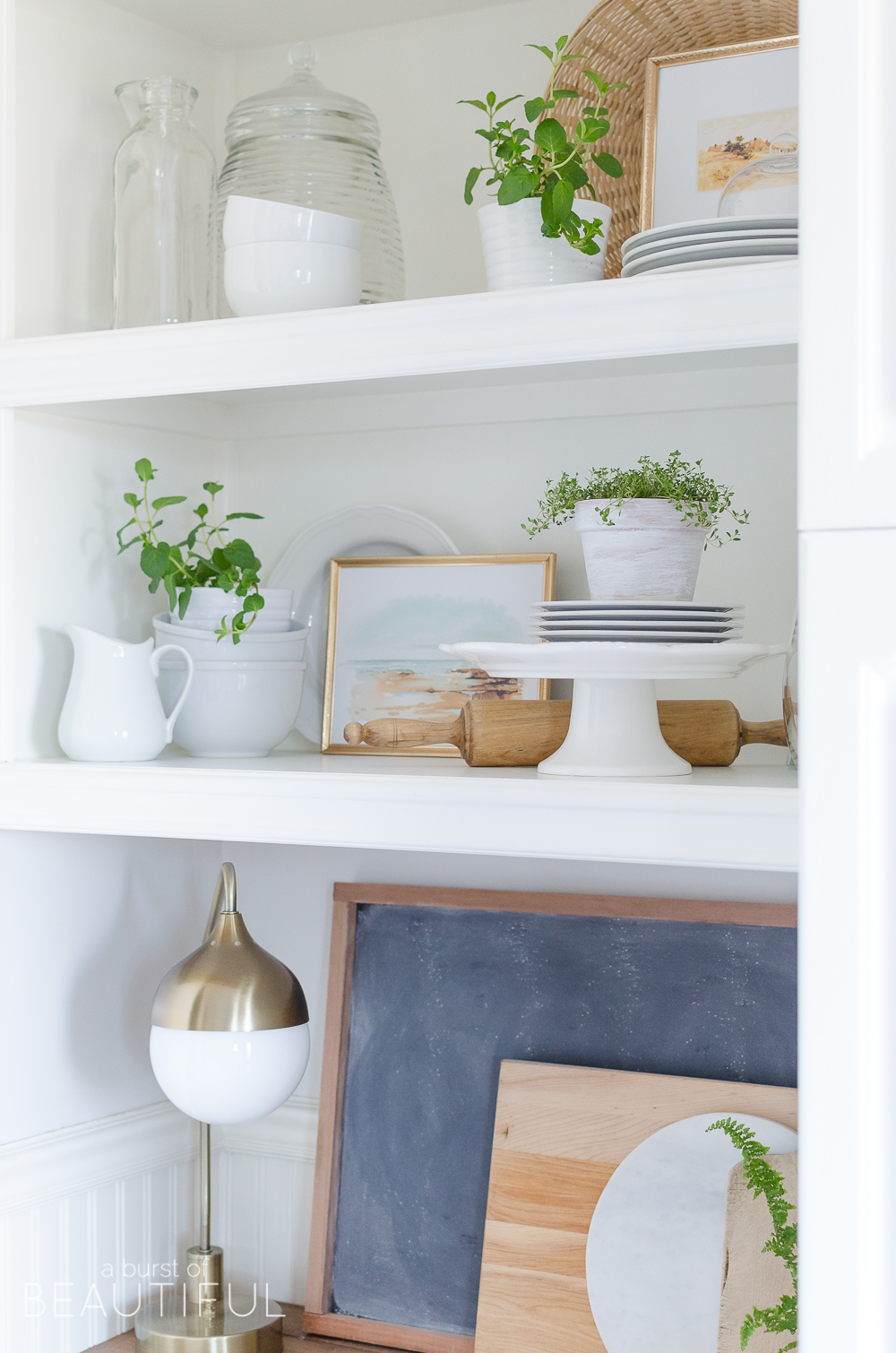
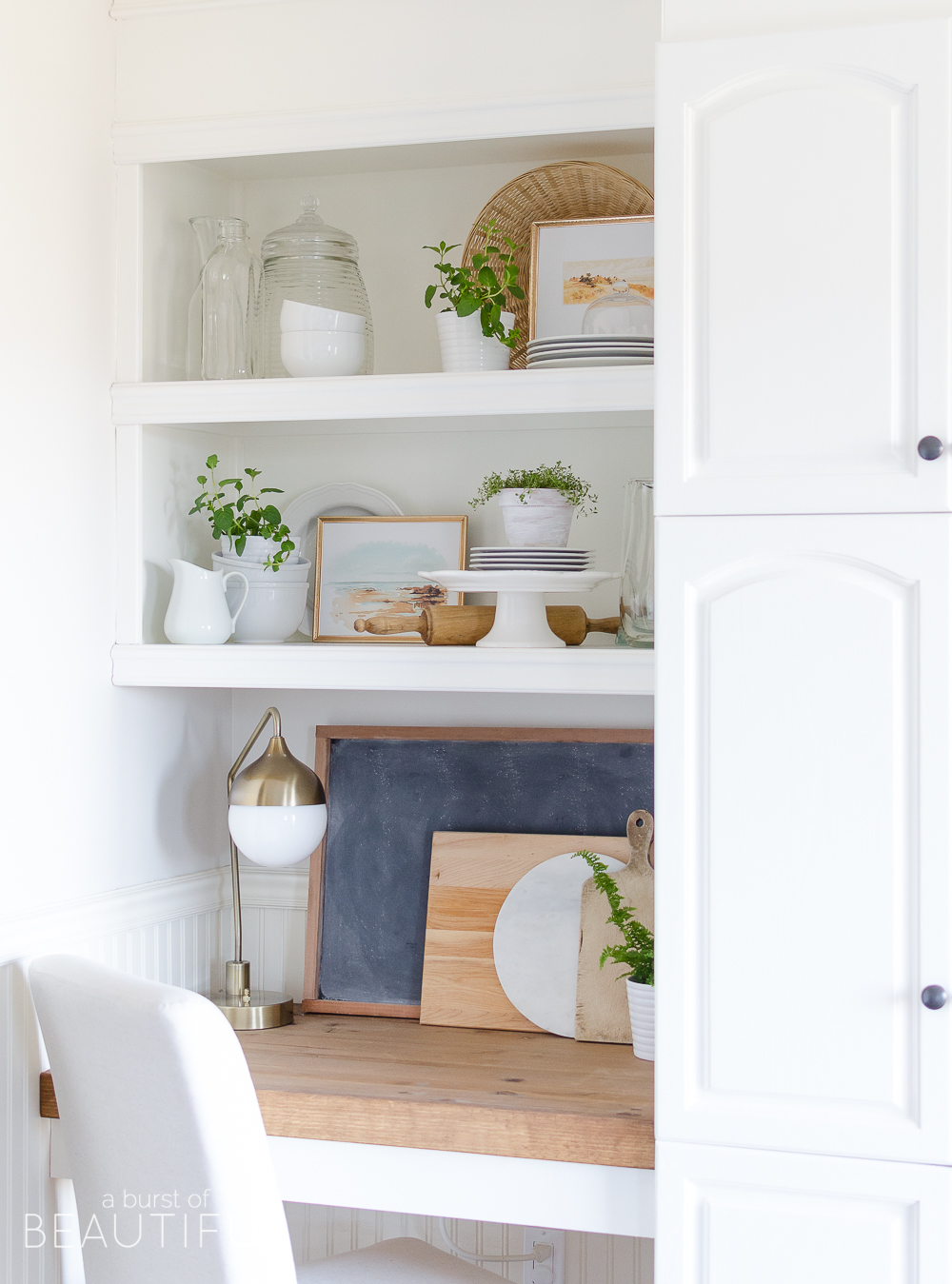
First, I start by deciding on a color palette. And of course, for me, that means a lot of white. I collect white dishware (because it makes pulling together a pretty table or hosting an impromptu party a breeze), and these shelves provide the perfect opportunity to display some of my favorite pieces. They don’t have to be fancy, for example, I like to store larger pieces, like our drink dispenser and cake plates, here. Because they are oversized items I don’t really have anywhere else to keep them while I’m not using them, but they are definitely pretty enough to be on display all of the time.
I also like to include vintage bottles, pitchers, cloches and extra plates and bowls too.
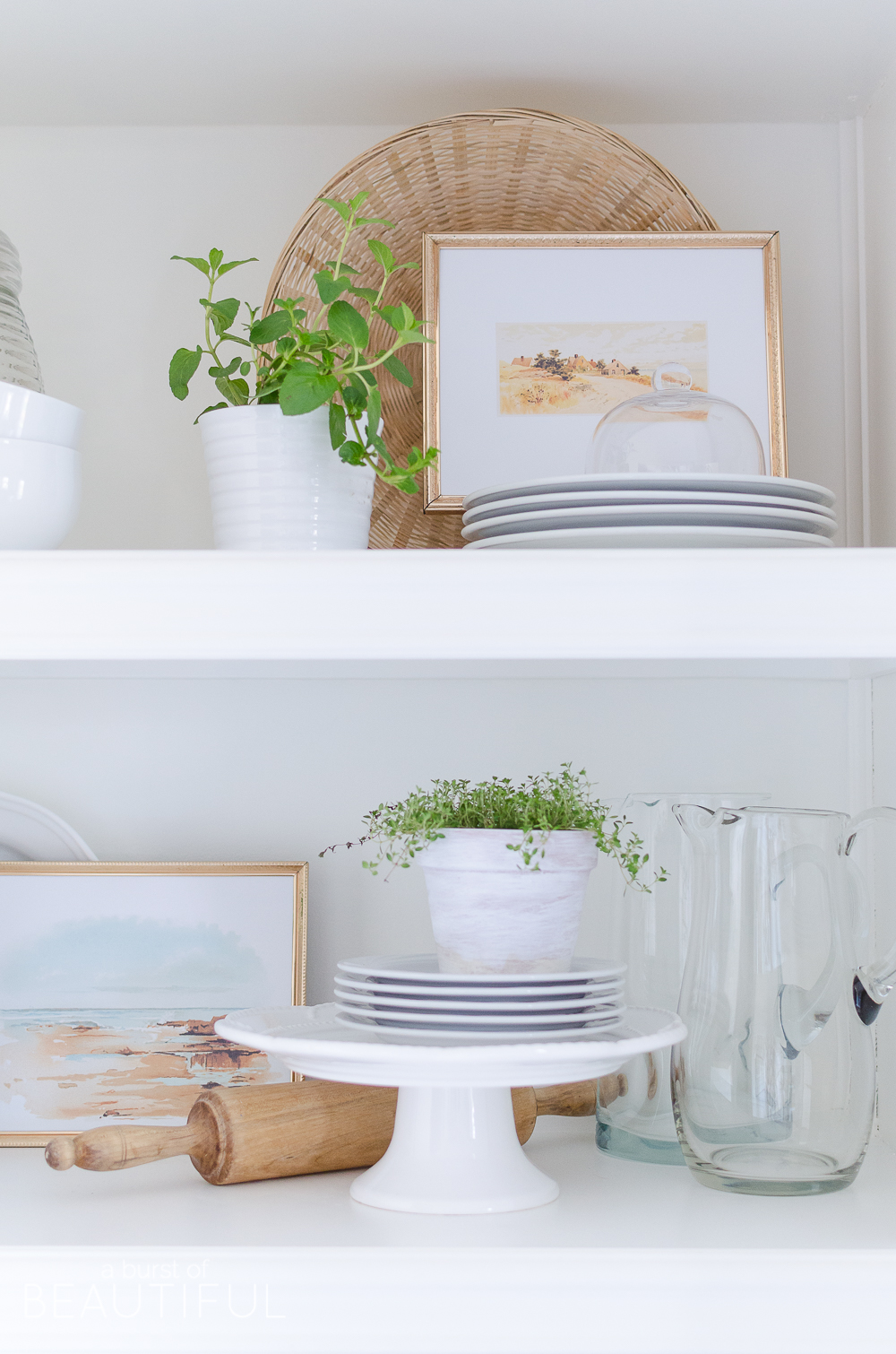
Scale is important when decorating open shelves, so that is something I always keep in mind. Bring in a variety of different sized objects, from teensy tiny bowls to large serving pitchers, it will help create a visually appealing vignette. Also, play with height. Stack plates and bowls on top of one another, lean pretty plates against the back wall of the shelves or layer items on a cake stand. You want to draw the eye around the entire space and avoid empty gaps.
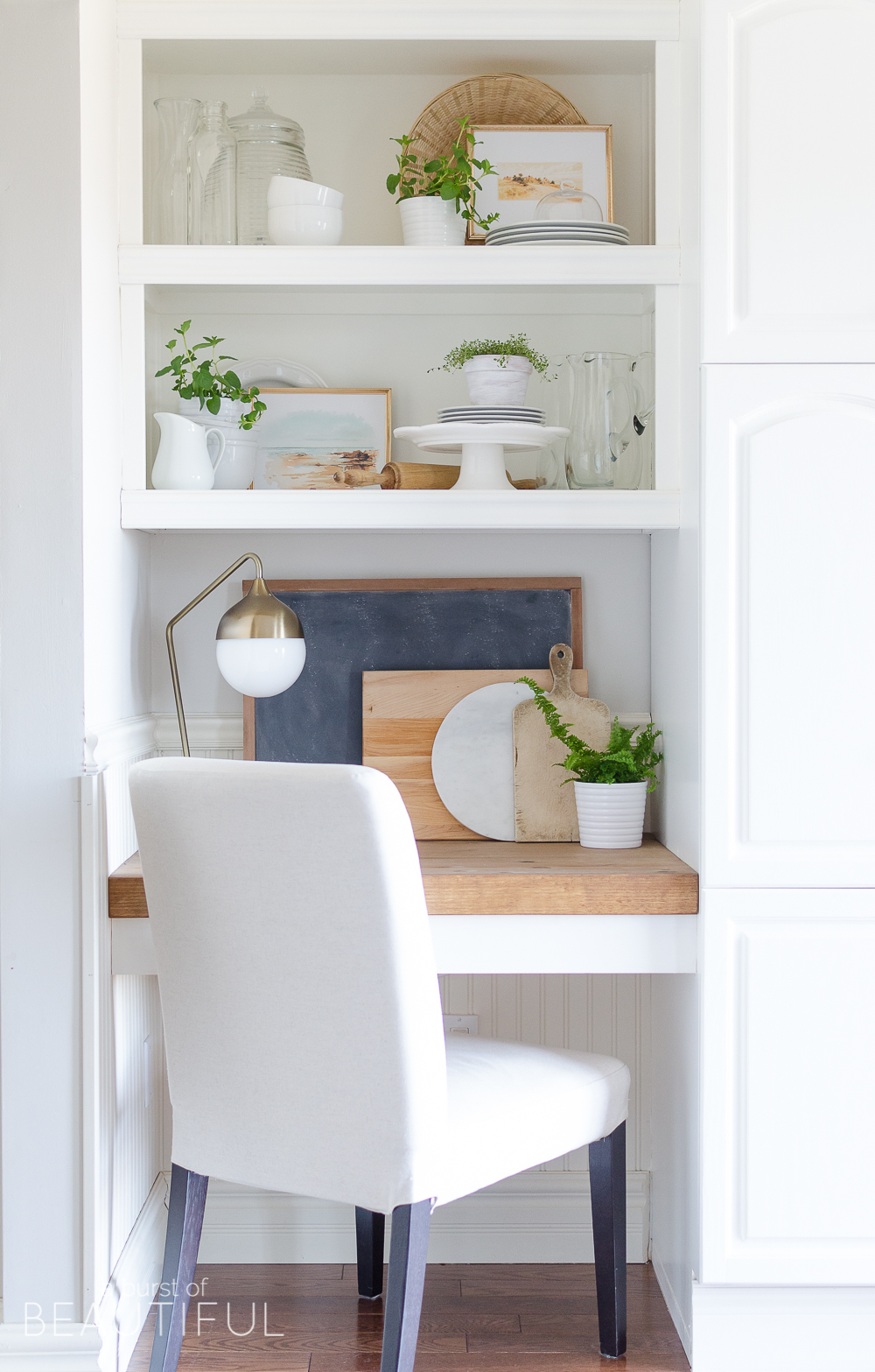
Now, all that white can start to feel a little stark, so next, I add a little warmth with texture. Worn cutting boards, woven wicker baskets and a vintage wood rolling pin are just a few of the ways I did this. The gold tones of the desk lamp and picture frames also help (you can read more about my gold obsession and why I am loving this trend here). I just love how the natural colors play off of the wood desktop.
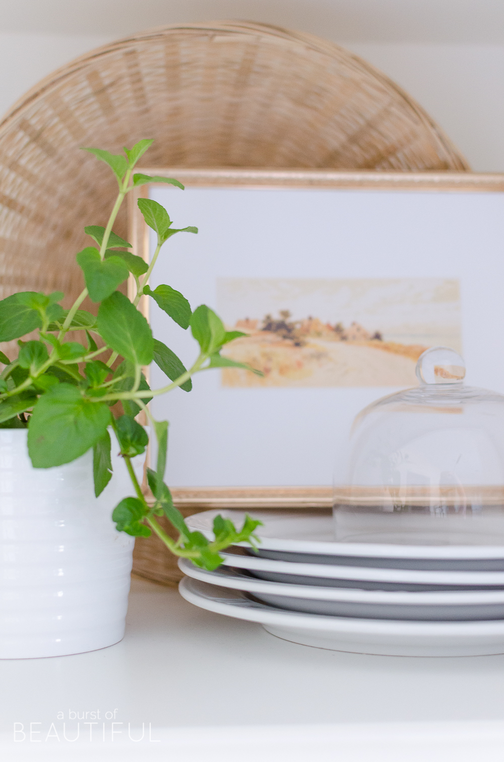
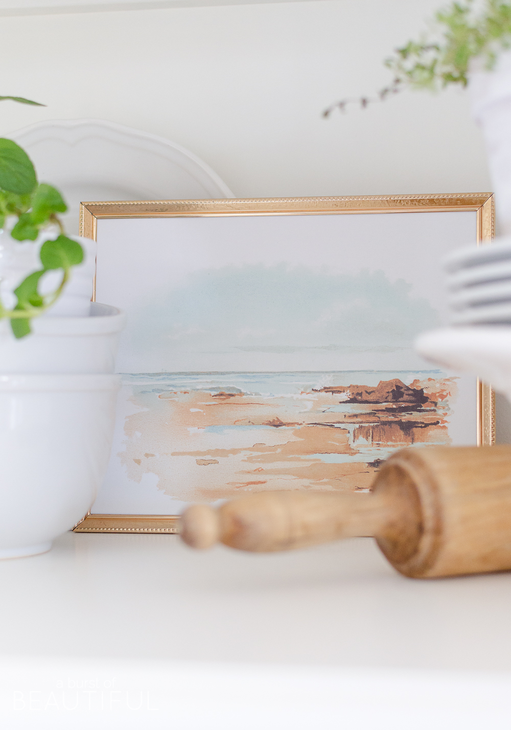
See those sweet little framed photos up there? They are probably my favorite addition to our shelves.
The frames I found for $1.00 each at our local thrift store. The subtle detail and worn patina of the frames add just the right amount of charm and interest to the space. They feel delicate and dainty…something I just love!
I simply found two vintage coastal prints within the same color palette online (you can find them here and here), and printed them for some easy art. The soothing blues and natural hues play off of the colors in our home, so it was a perfect match.
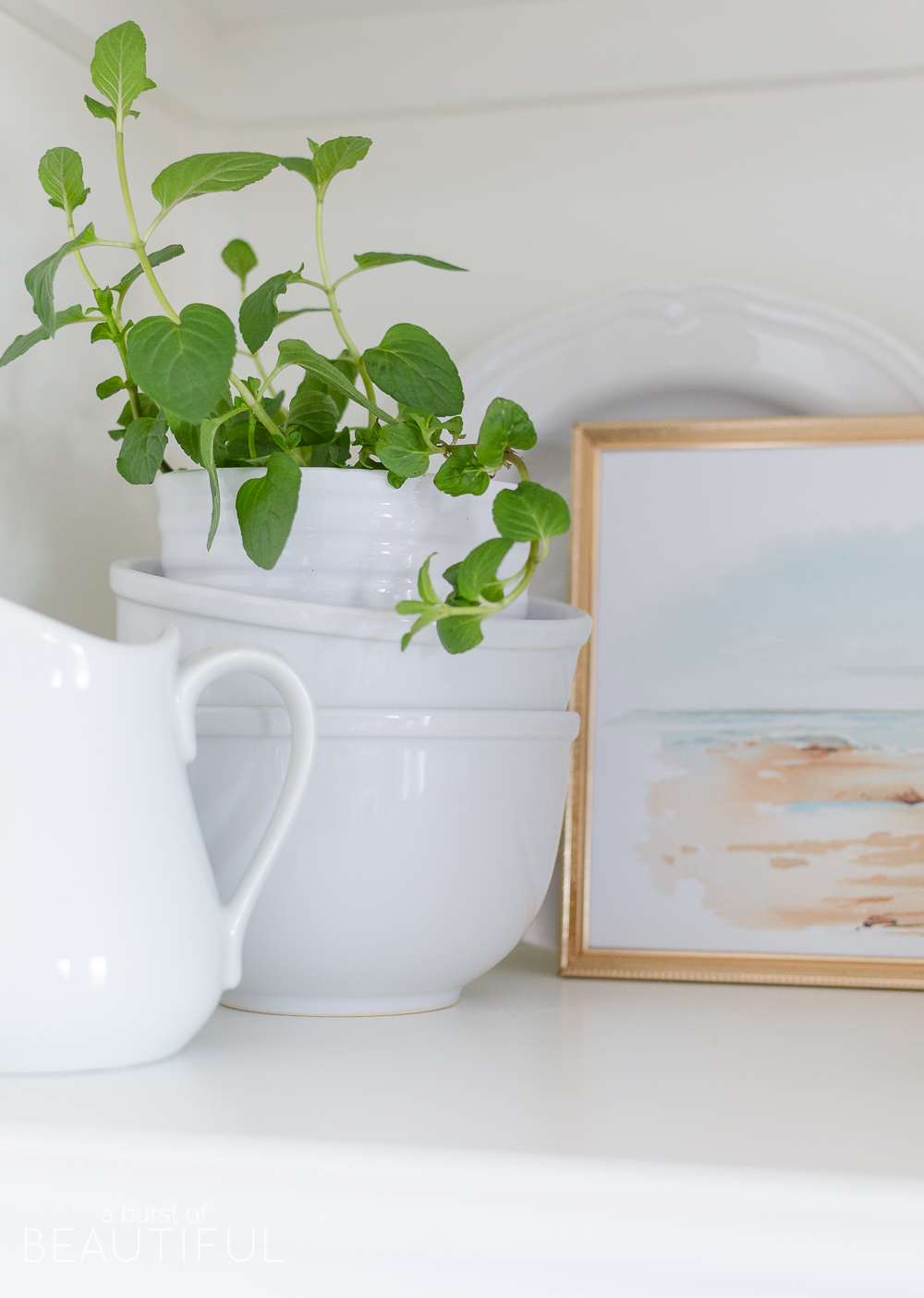
Finally, I added a hit of color with a few fresh plants. Adding greenery, like these herbs (I used mint and creeping thyme) and a small fern brings life and interest to any space. And until we get our garden planted and thriving again this year, we rely on potted herbs in the kitchen for cooking, plus they smell so good!
For those of you struggling with styling shelves, I hope this post helped a bit. And remember these tips apply to any type of shelving, not just in the kitchen. If you have any questions, please leave us a comment, we always love hearing from you!
Alicia xo

Dianne says
I love how they turned out. A great eye catching nook in
your beautiful kitchen..
Alicia says
Thank you so much, Dianne. It’s such a sweet little corner and I always have so much fun decorating here!
Amanda says
Gorgeous styling Alicia! The color scheme is so pretty and calming. I feel like I’ve struggled for years when it comes to styling shelving. Your tips are great! I’m in love with the shore line print. I’ve been looking for something similar for my powder room… I’m going to grab mine now!
Alicia says
Thank you, sweet Amanda! And aren’t those prints so pretty? I know I can always count on The Graphics Fairy for the perfect vintage prints!
Erica says
This post is very helpful! I’m trying to learn how to style my bookshelves and my China cabinet and have it look cohesive and uncluttered. You pull it off perfectly! It looks really pretty and not too “busy”.
Alicia says
Thank you, Erica! It’s definitely a skill I have spent a lot of time honing… it didn’t happen overnight, and I am still learning to this today. Just have fun with the process and try not to over think it too much! xo
Sarah says
Wow that desk top is fabulous and my cupboards are full of mainly white too 🙂
Alicia says
White is just the best when it comes to collecting dishware! 😉
Marly @ A Brick Home says
Wow, so beautiful! I’m also trying to perfect my styling techniques. I think you have it down – looks like it should be in a magazine!
Alicia says
Thank you, Marly. It’s definitely something I have been working at…practice makes perfect, right? 🙂