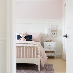
This sweet toddler girl’s pink bedroom is designed with soft colors and the decor elements create a whimsical feel. It is a simple and clean design.
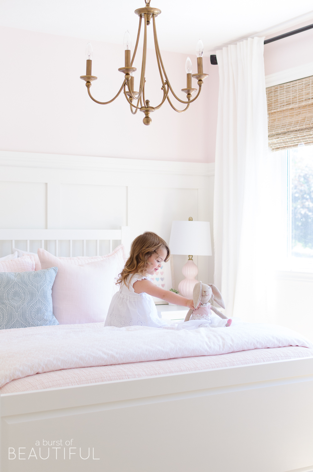
Well, the day is finally here! After weeks of planning, designing, painting, building, more painting, shopping, and decorating our little one’s sweet toddler bedroom is finally ready!
Just like her nursery, this is the one room in our home that we have poured the most love and thought into. It truly was a labour of love, and we couldn’t be happier with it.
If you read our blog regularly you probably already know this story, but if you’re new here I’ll share it again. When we found out I was expecting we decided to keep the gender of our baby a surprise. We wanted to learn if we were bringing home a baby girl or boy the first time we held that new baby in our arms and not a moment before. Those nine months were full of so many wonderful things, and the anticipation made it even more special.
But as a planner, that put one major obstacle in my way, planning and designing the nursery. And what I process it was! Nick says that I have a hard time making decisions. It’s true, I admit it, I have a really hard time.
We thought about waiting to set up the nursery until after our baby arrived, but in the end, we decided it would be best to have everything ready so we weren’t spending those first few months thinking about paint colours, cribs, or mobiles when we should be enjoying our sweet new baby.
We moved forward and designed a gender-neutral nursery. It was such a sweet space and I will always love it, but once we brought home our baby girl I wanted to surround her in soft sweet colours, patterns, and pieces that spoke to her personality.
I held off knowing we couldn’t possibly redecorate her nursery again so soon, but continued to think about the day we would transition her from her nursery into a big girl bedroom.
Now, the second time around, we designed a simple gender-neutral nursery, that could easily incorporate colours, patterns, and personality once our little one arrived. It was the perfect way to make sure we had a space to bring our baby home to, while still giving us the chance to create a nursery that reflected our little one’s sweet personality. See how we did it here:
- Serene Gender-Neutral Nursery
- Adding Colour and Personality to a Neutral Nursery
- A Sweet and Colourful Baby Girl’s Nursery
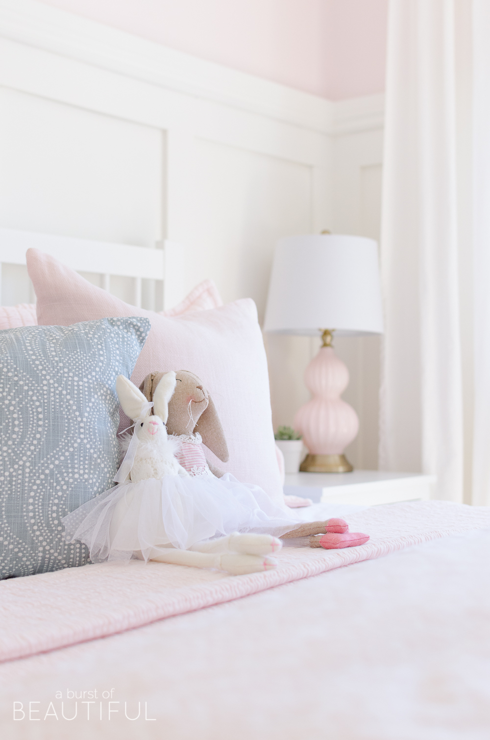
Once our daughter turned two, we began thinking of transitioning her from a nursery to a big girl bedroom, and this space of hers was so much fun to design. It was exciting to play with colours and elements that were a bit out of my comfort zone.
It was also so much fun watching our little one take part, she was part of the design process from the very beginning, helping choose paint colours, bedding, and even art (see our tips for designing and decorating kids’ rooms here). She has really become quite the little designer, it is so sweet watching her hold paint samples against the wall or move pillows throughout the house until she has it just right. She really is following in mom’s footsteps!
I want to take you through our design process and share each detail that makes this room so special.
The Finishes
It all started with the colour pink. Our daughter is a girly girl in every sense of the word. She loves dresses, nail polish, lipstick, and of course, anything sparkly. So when we started talking about transitioning her from her nursery into her new room I started with the obvious question, colour. And I got the obvious answer, pink!
We headed out in search of the perfect shade of pink and scooped up every pink paint sample we could find at Benjamin Moore and headed home to make some decisions.
Now, pink can be a very overwhelming colour, even the softest shade can seem intense when painting an entire room so it can be tricky to choose just the right shade. I knew two things when we were settling on a color. First, I knew we wanted the softest shade we could find, a very pale blush with just a hint of color was what we were after. Second, I also knew the majority of her walls were going to be covered in board and batten and painted white, so no matter what color we chose the board and batten would really help to balance the space.
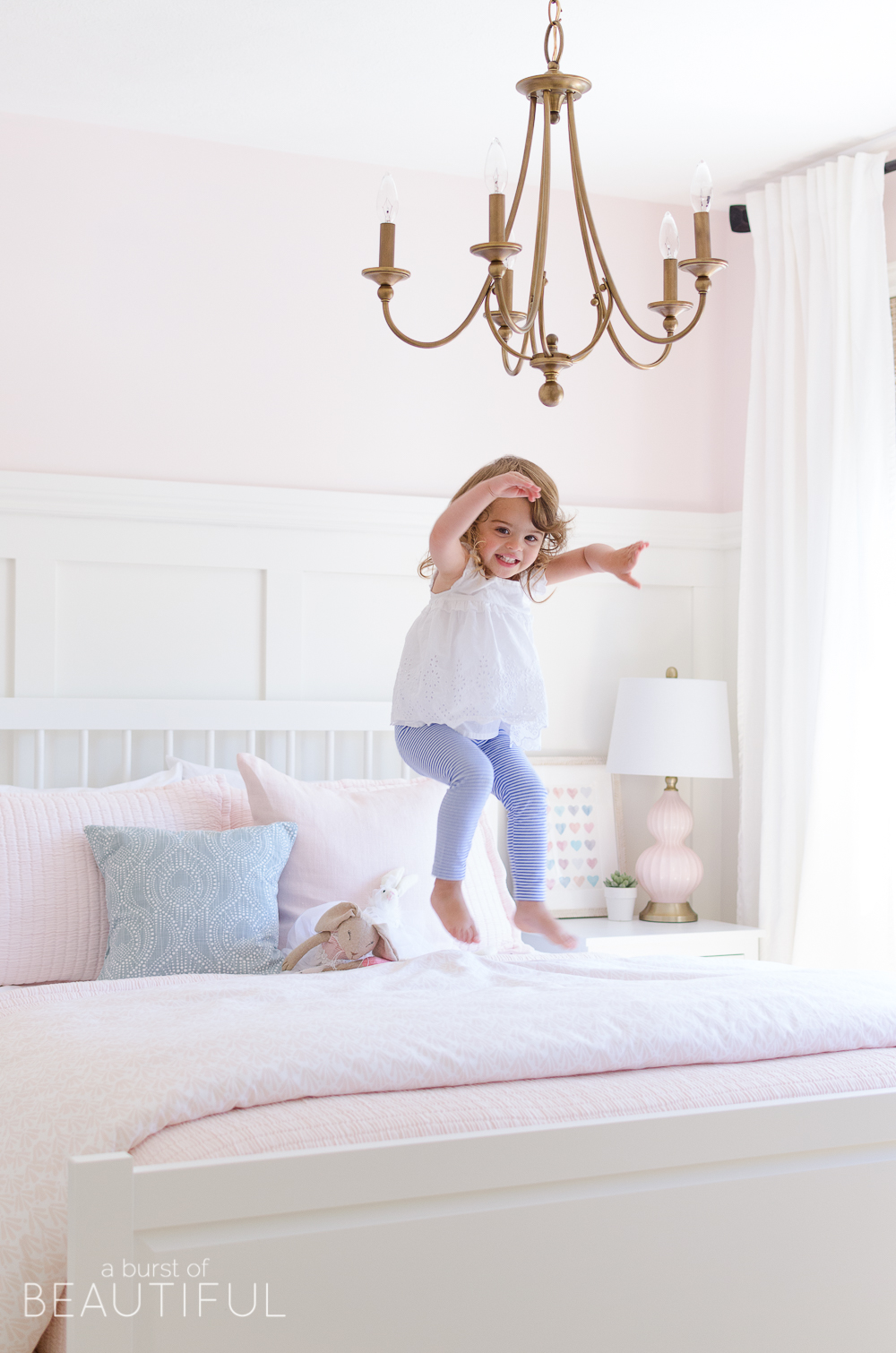
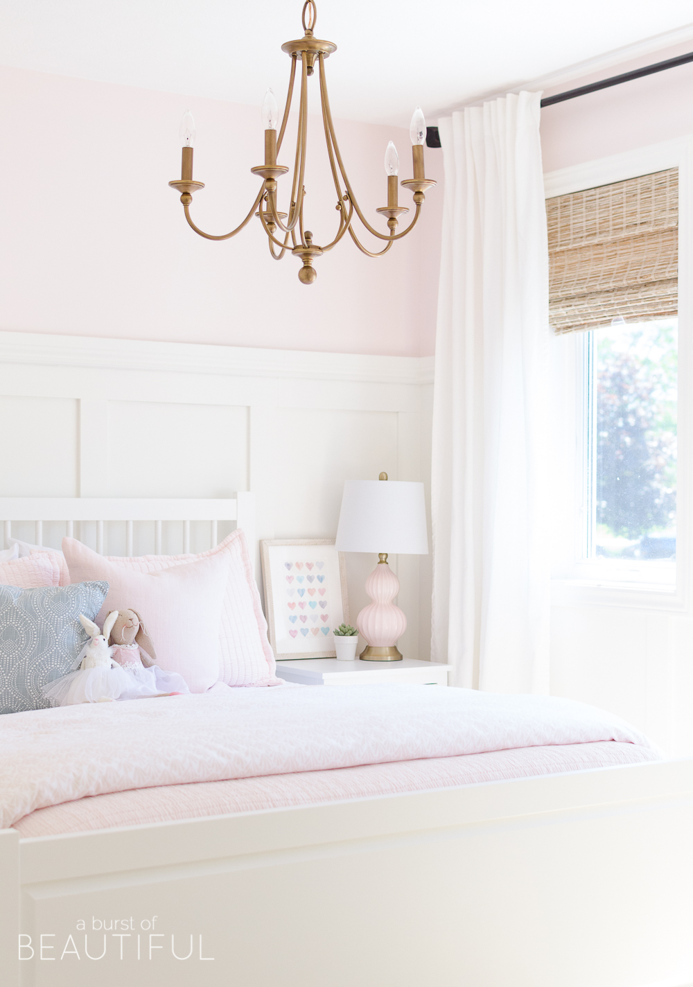
After much debating and colour testing, we settled on this beautiful shade of pale pink. It’s called Pink Bliss and it’s from Benjamin Moore. It’s had just a hint of color and makes her bedroom feel bright but cozy.
See our favourite shades of pink here.
Before we could get this beautiful colour on the walls we had to tackle the board and batten (you can see our board and batten tutorial here). We wanted to carry the board and batten from the living room and dining room into the girls’ bedrooms to create a sense of unity.
Adding millwork is an easy way to add character and detail to a new home, and I love how it helps bare walls feel a little less boring. So when it came to our little one’s bedroom, board and batten was an easy choice. And of course, we painted it my favorite shade of white, Simply White, again from Benjamin Moore. It’s bright but still warm and we use it for all of the trim in our home.
The Furniture
We were really lucky in terms of furniture, we didn’t have to buy any new pieces for the space. We already owned a dresser and bed frame that I loved and fit the design I had in mind. We simply gave the bed frame a coat of white paint (Benjamin Moore’s Simply White) and we were set.
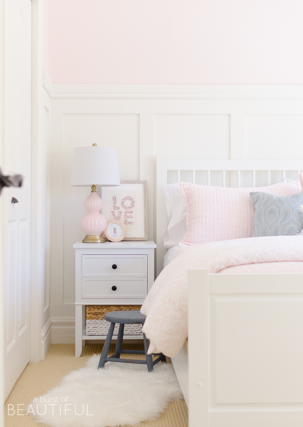
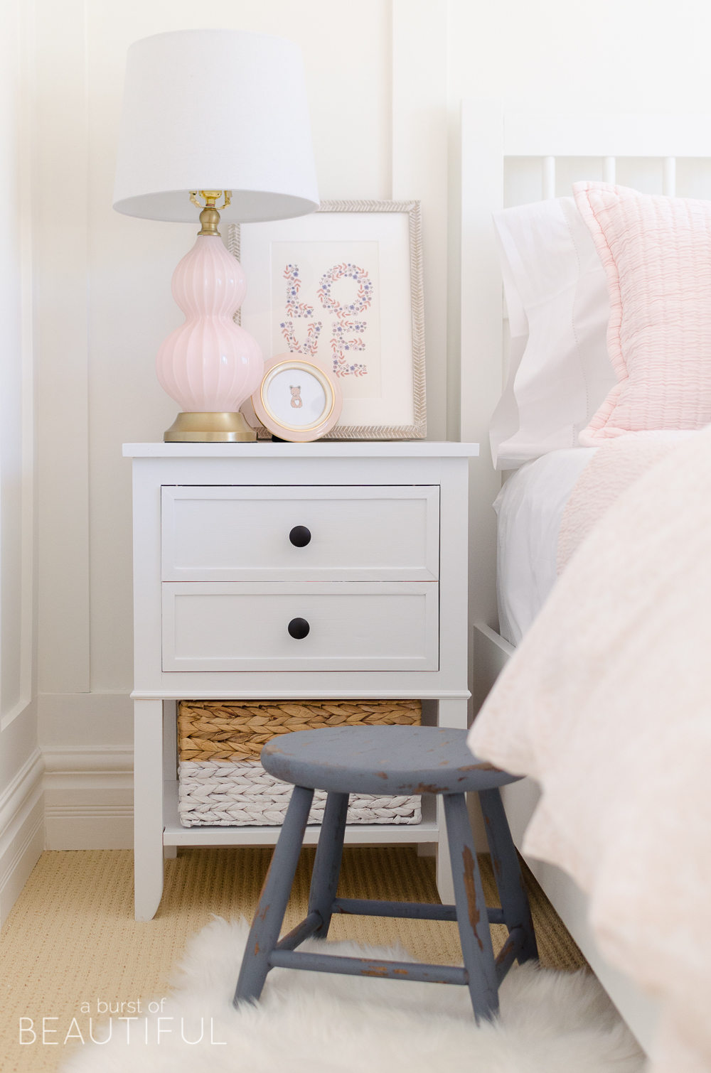
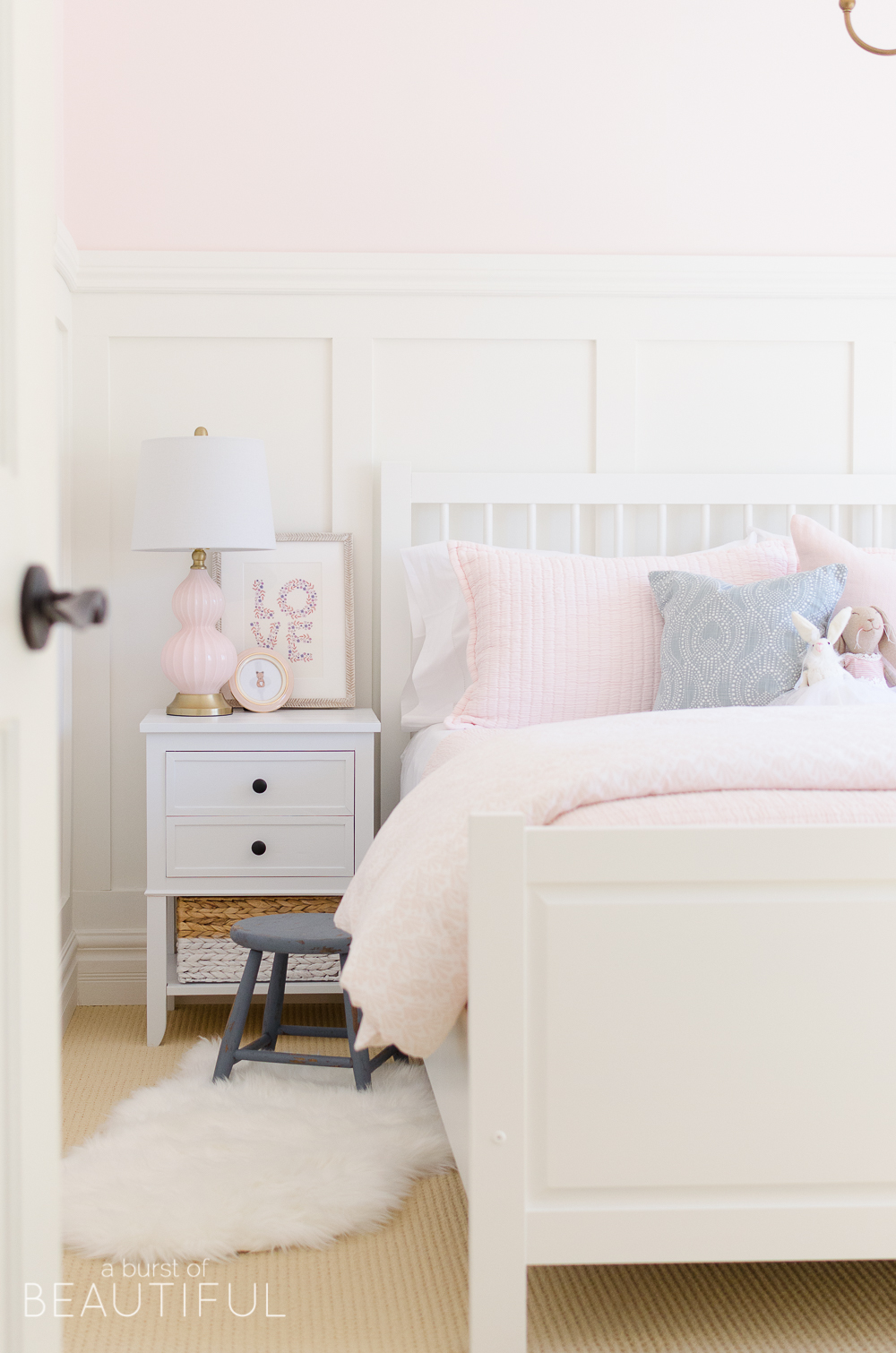
Nick built her new nightstands see the plans here), and I love how delicate and dainty they are.
When designing a space I always focus on the foundation pieces first. These are the big-ticket items that won’t be changing often, like furniture and window treatments. You want to make sure you are investing in items that you won’t tire of easily or quickly become an outdated trend. You also want to look at the quality of each piece and make sure it will stand up to life in your home.
The Window Treatments
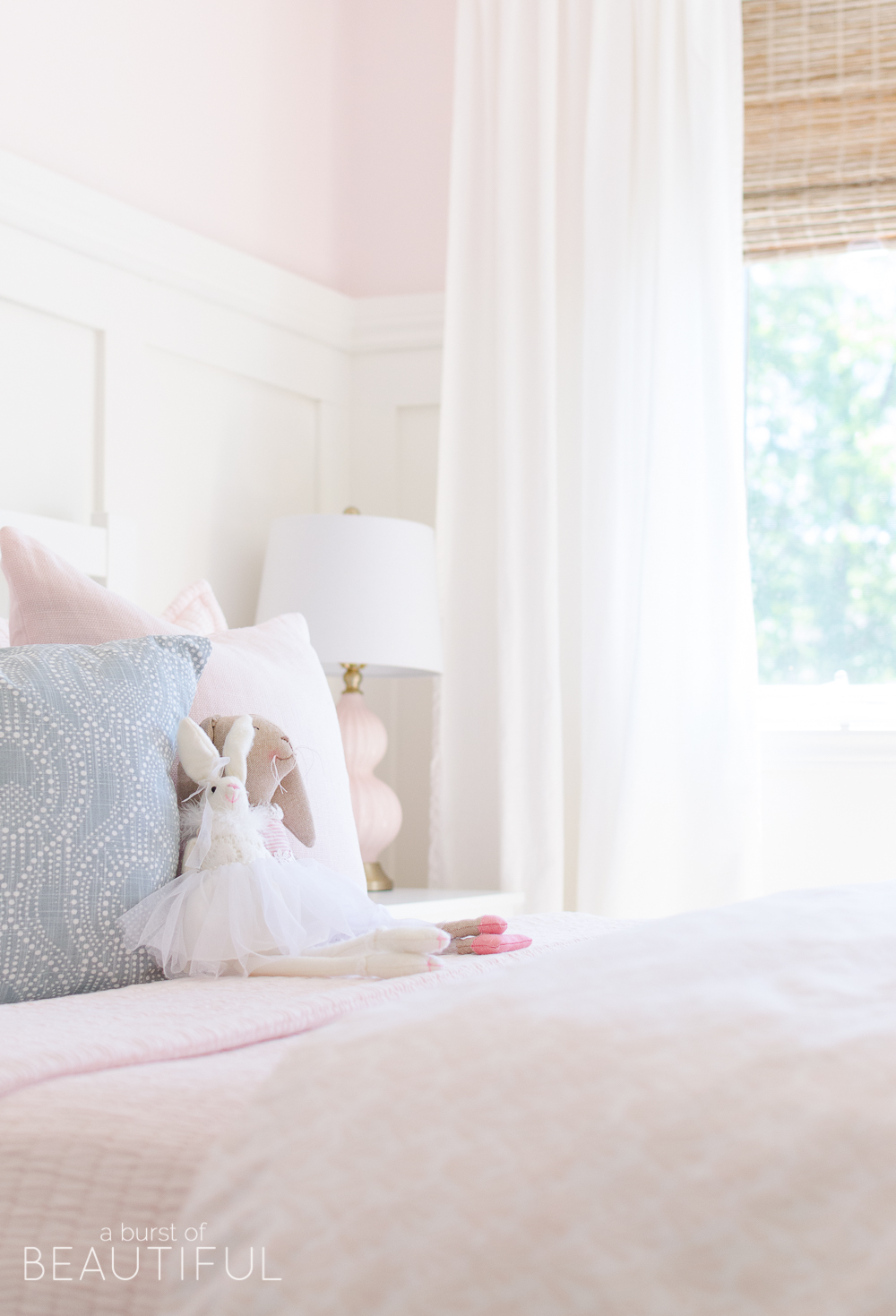
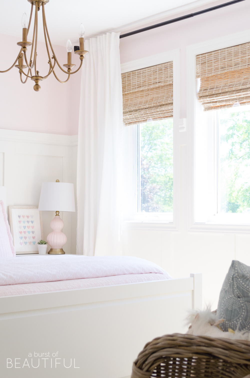
When it came time to decide on window treatments we decided to keep the look simple with white curtains paired with woven wood shades.
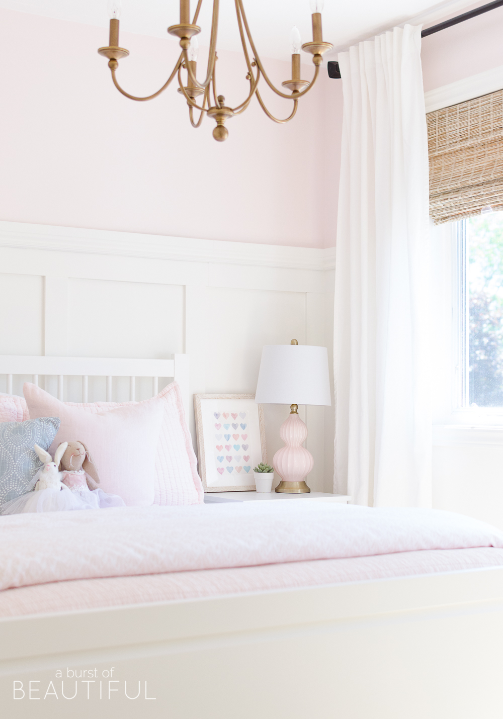
I think this is such a timeless look, and it fits so well with our home’s aesthetic. Last year we added these gorgeous shades from Blindsgalore to our living room and our bedroom, and I cannot get enough of them. The beautiful woven texture adds so much warmth and detail to each room, and the soft honey-like colour compliments the many natural wood tones throughout our home. So I knew they would look amazing with the soft pastel colours of our little one’s bedroom.
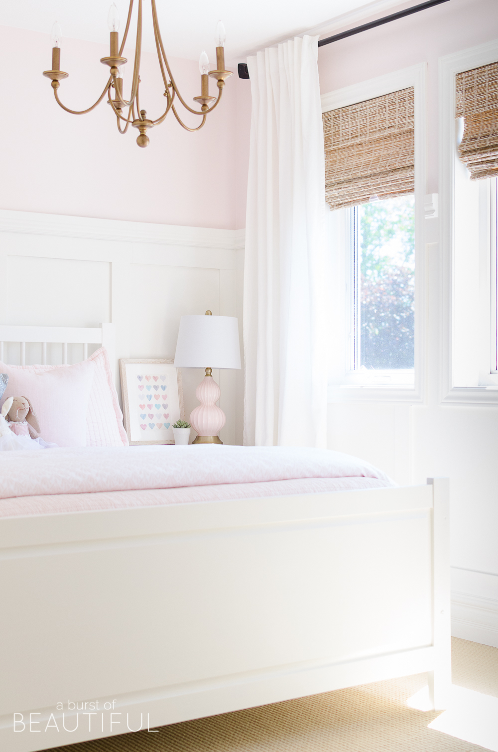
They are also cordless which means added safety, which is a huge priority for us. If you’re looking to invest in window treatments you can read my advice on choosing the best ones for your home here.
The Details
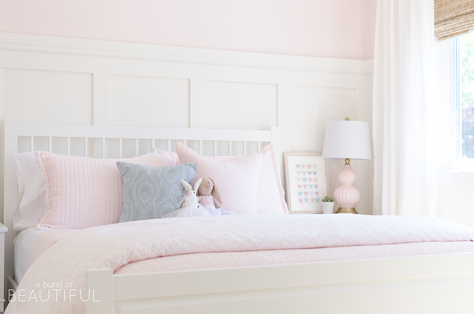
Once we had all of the big decisions made it was time to move on to the little details. First, we settled on bedding. I love the look of a simple quilt or coverlet on a bed, so when I came across this beautiful pink coverlet from Annie Selke’s Pine Cone Hill I knew I had found the perfect bedding for our little one.
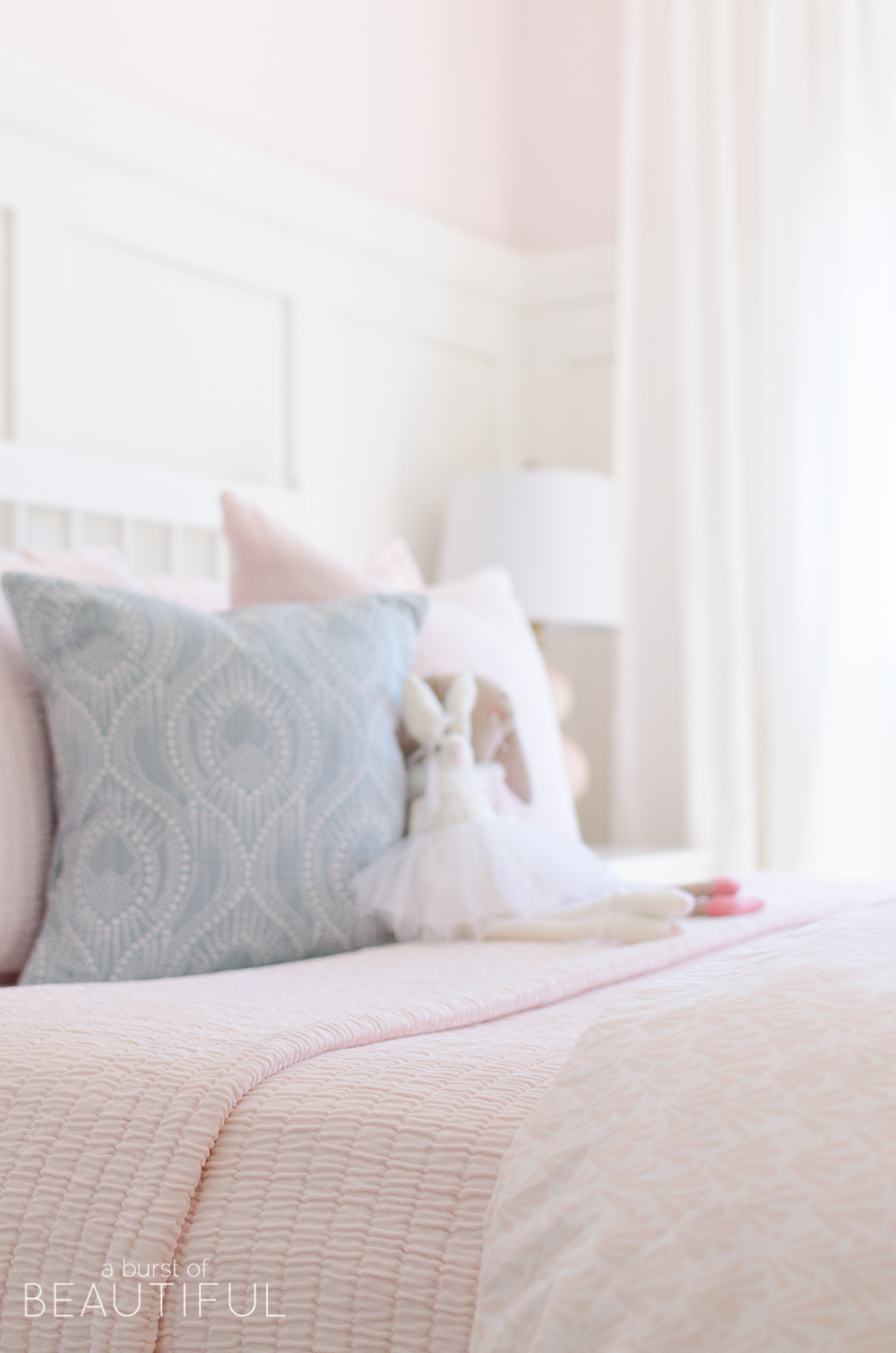
I knew this coverlet and matching shams would be pretty, but when I opened the box I was surprised by just how beautiful it was. It was so soft, and the colour was just the perfect shade of pastel pink. I knew our little one would love it, and that just made me even happier.
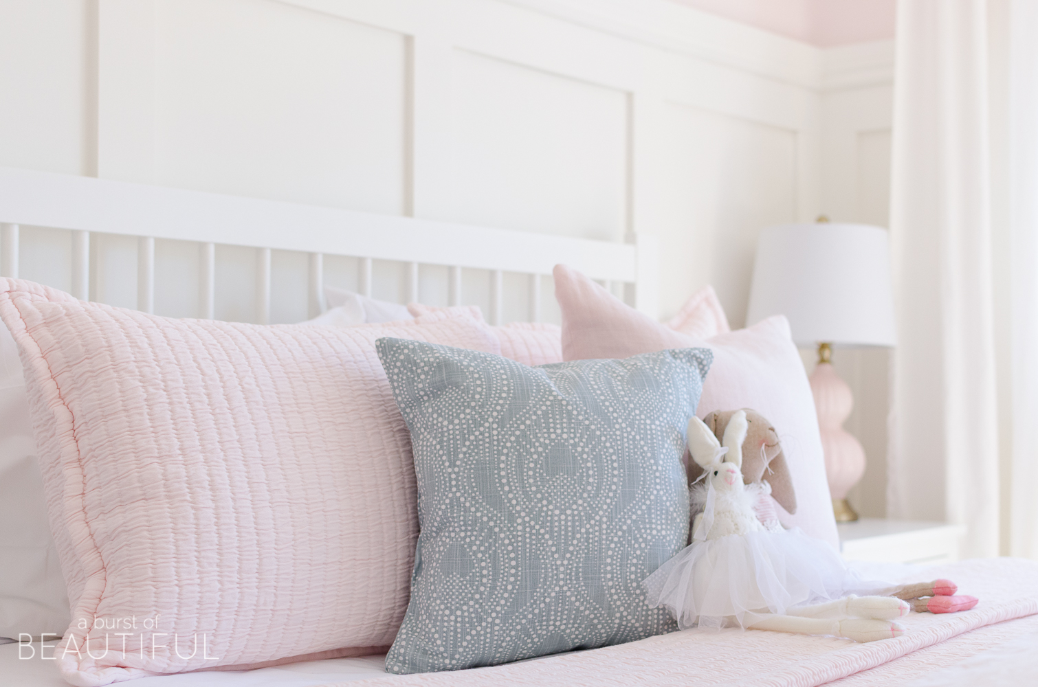
I made up her sweet little bed for the first time using Annie Selke’s Pine Cone Hill Classic Hemstitch sheets and Matelasse coverlet and shams. I topped it off with an existing duvet we had, folded at the foot of her bed (for those extra chilly nights), and two throw pillows.
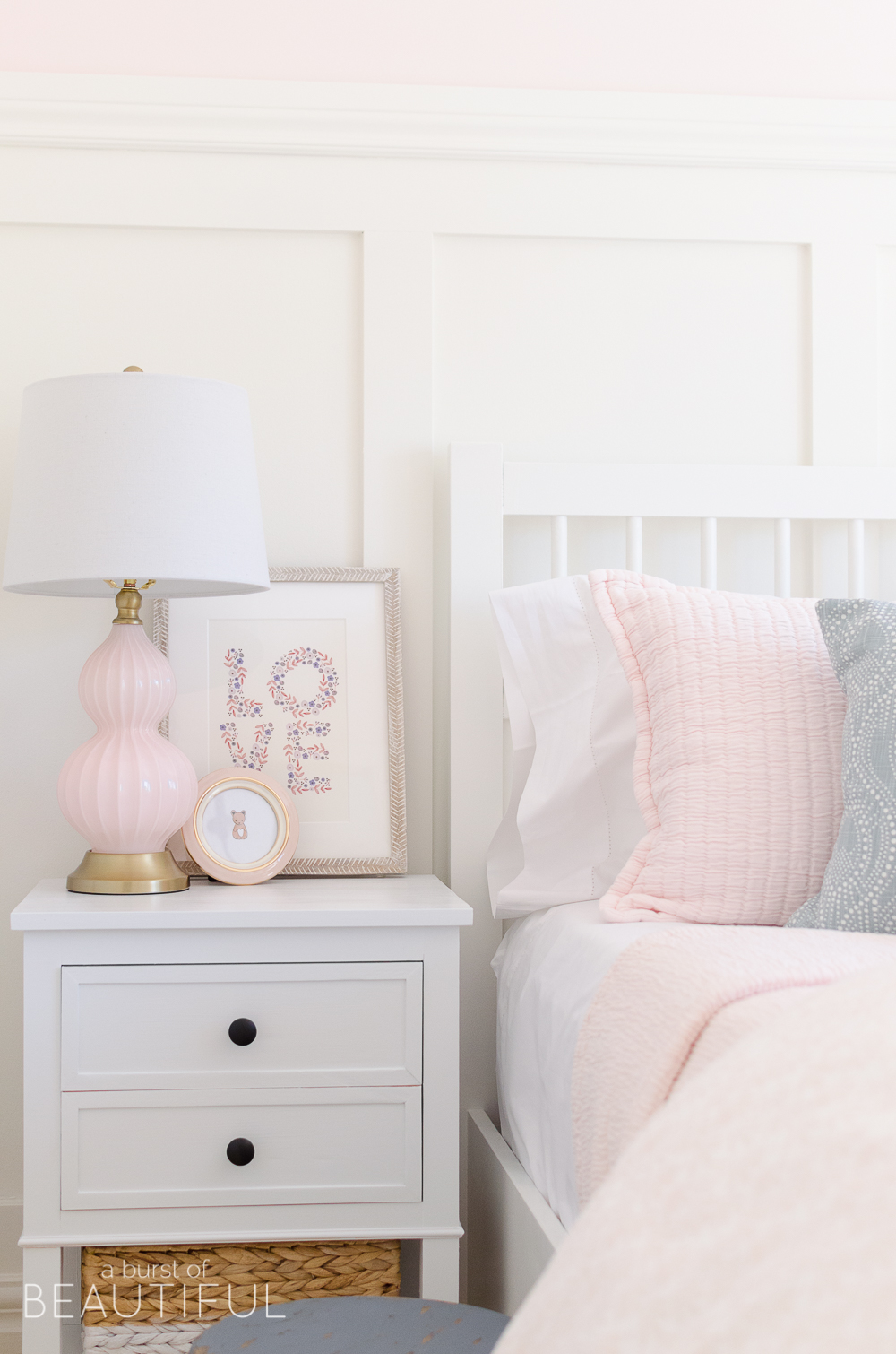
My hope for this room was to create a space that was sweet and feminine, but that also felt fresh and youthful. And one of the ways I achieved this was with art. The two framed prints sitting atop her nightstands are child-like and whimsical (see them here and here). They help to bring in a mix of different colours to her space to keep it from feeling too monochromatic (I didn’t want the entire room to be white and pink). And the whitewash herringbone frames are a favourite of mine, the detail is just so fun.
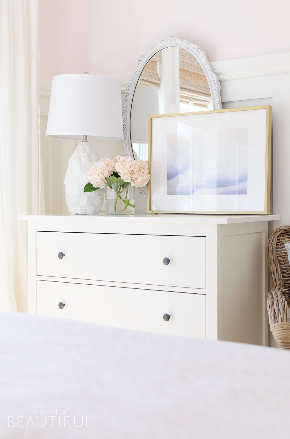
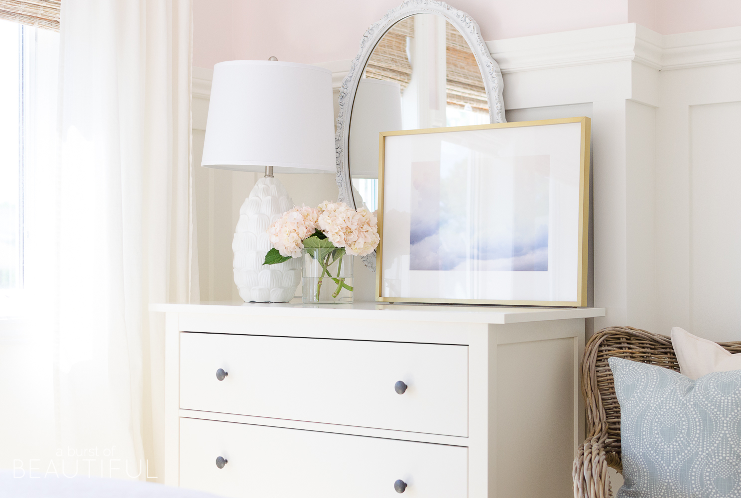
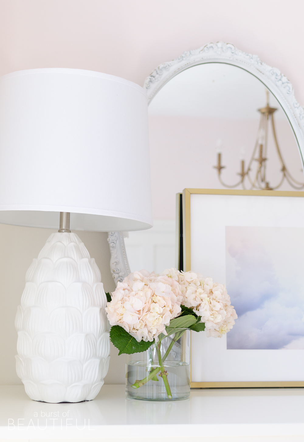
For above the dresser I chose a simple cloud print in soft shades of pink and purple. It’s a little more grown-up, but still sweet enough for a little girl’s bedroom. For this one, I opted to frame it in a slim gold frame for a more modern feel, which makes a really great contrast against the vintage mirror behind it.
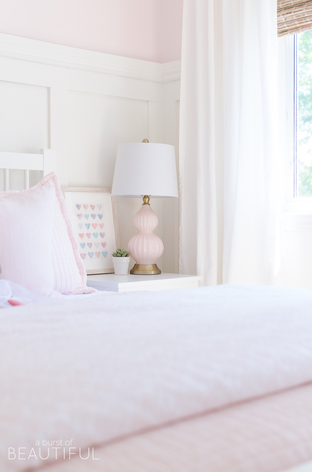
I scoured Minted, one of my favourite places to find art, and saved a copy of each piece of art I thought would be beautiful in her bedroom. Once I narrowed down the choices I let our little one make the final call. I think she did a pretty good job, don’t you? Her favorite is the LOVE print.
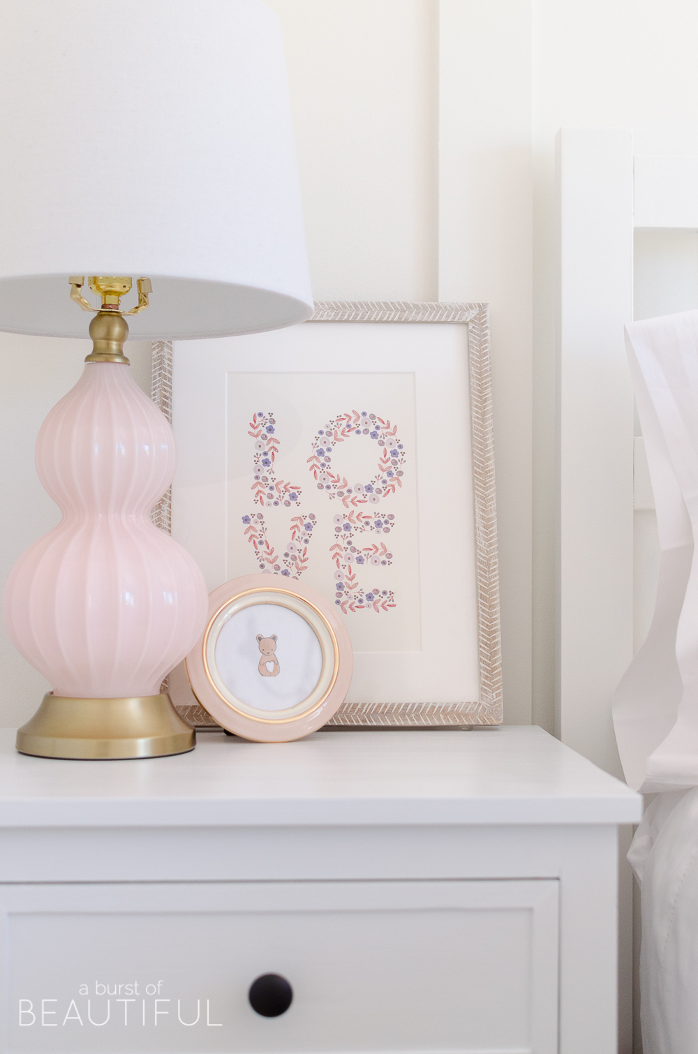
Art is such a fun and easy way to add personality to a space and it really helps to set the tone. Have fun with it and try not to overthink your choices, if you need a little more help, see our tips for choosing art for kids’ spaces here.
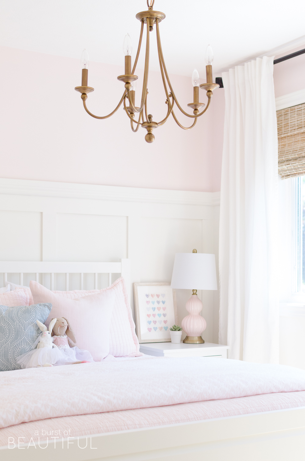
The very last piece we chose was this beautiful chandelier, and that’s because I had a really hard time deciding on a light for this space. I knew I wanted a fixture in a simple design, something that was fairly delicate, and nothing that was big and bulky because I knew that would obstruct the sightline into her room. So although I had a fairly good idea of what I was looking for I couldn’t make a decision.
I bounced back and forth between a classic gold finish, something painted in a fun and youthful color, like pink or blue, simple rattan, or a vintage chandelier with wood beads. But I kept coming back to this classic-aged brass chandelier. I love how classic it feels, but at the same time, it is still playful. Our girl gave her stamp of approval and now she tells me it’s her favorite part of her new bedroom.
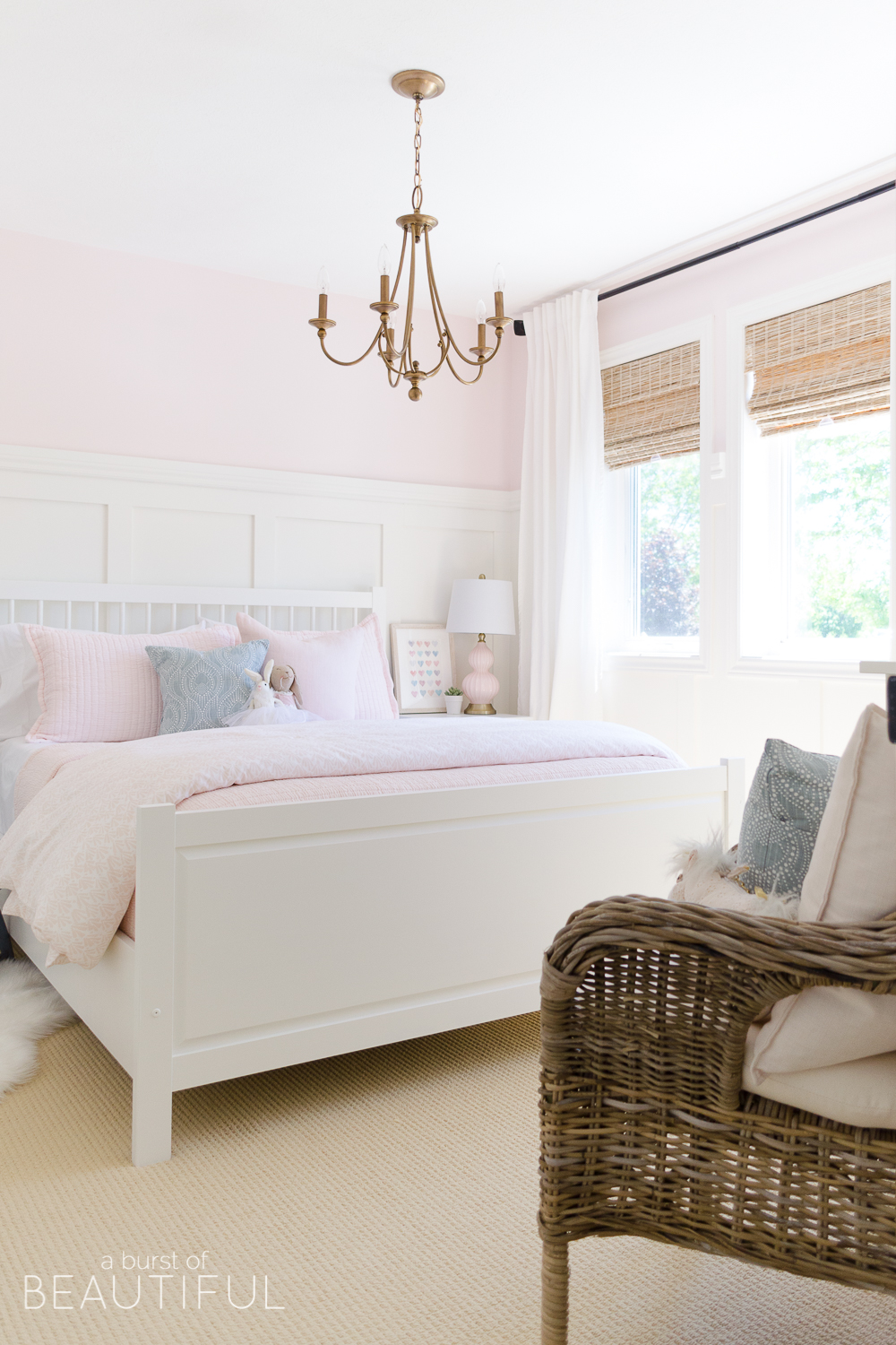
When I started planning this room I set out to create a sweet and feminine space that didn’t feel overly childish. I wanted a room that would grow with our baby, by simply switching out details here and there as she gets older (see the latest update here). We did our best to give her a happy space of her own, a space that will spark her creativity and support her imagination.
Details at a Glance
Walls | Pink Bliss by Benjamin Moore
Trim | Simply White by Benjamin Moore
Board and Batten | Tutorial
- Bed (Ikea discontinued | similar)
- Nightstands (tutorial)
- Baskets
- Lamps (HomeSense | similar)
- Matelasse coverlet
- Matelasse shams
- Sheets
- Pink throw pillow (HomeSense | similar)
- Blue throw pillow
- Duvet (Restoration Hardware discontinued | similar)
- Sheepskin rug
- Heart print
- LOVE print (Minted discontinued)
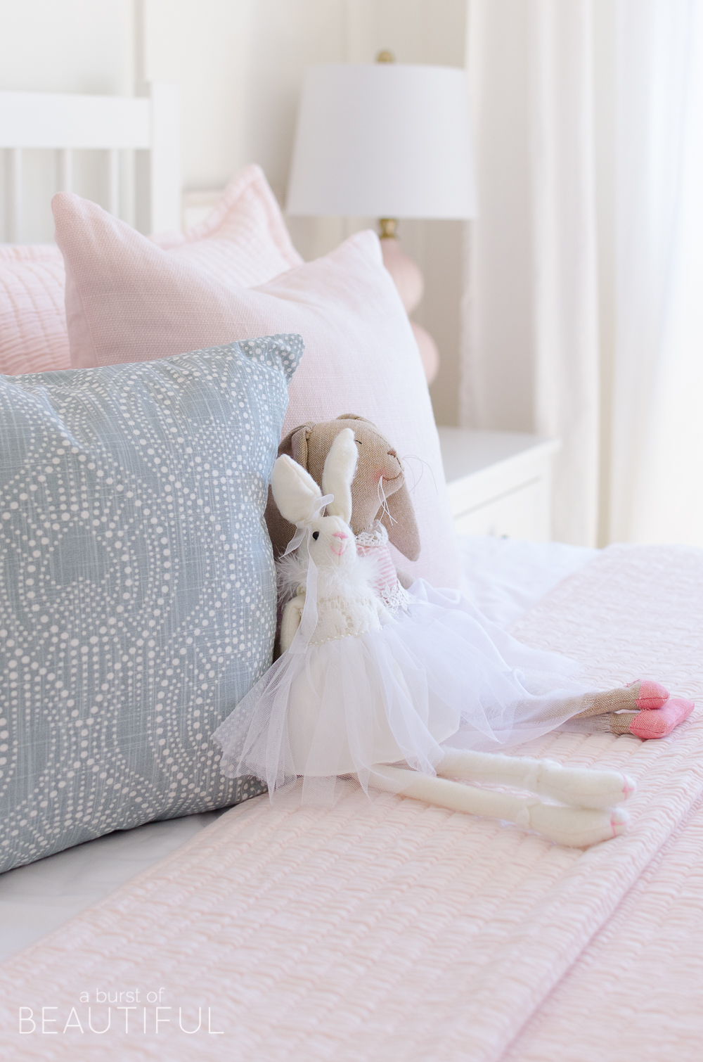
- Bunnies (HomeSense | similar)
- Curtain panels
- Woven wood shades
(NOTE: The material of our shades has been discontinued, however, Blindsgalore has let us know two products and colors that closely match our shades – Faroe Twine and Loas Sand) - Dresser
- White lamp
- Mirror (vintage | similar)
- Cloud print (Minted discontinued | similar)
- Chandelier (Lowes discontinued)



Elyse says
The room is absolutely adorable!!! Where is the carpet from?
Alicia says
Thank you, Elyse! The carpet was existing in the house when we moved in, so I am not sure where it is from. But the little faux sheepskin rug is from HomeSense (or HomeGoods if you are in the US). 🙂
Lindsay says
Lovely room! Can you tell me if the framed prints on each side of her bed are just leaning against the wall? I’m struggling with hanging art above the nightstands in my daughter’s room. I love the look of them sitting on the nightstands but worry they will just keep being knocked down.
Alicia says
Hi Lindsay,
Yes, the frames are just leaning against the wall. I actually just finished a post about this topic this week! You can see it on our homepage still, or search “how to hang art on board and batten” and I go into all of the details. 🙂
Kelly says
This room is just so previous! Absolutely the epitome of a girly-girl room. You did a fantastic job putting it all together!
Best,
Kelly
Alicia says
Thank you so much, Kelly! It was such a fun space to design!
Amber says
So much detail in this, thank you!
I’m interested in making the nightstand (and a second one I’d like to tweak to be used as a desk).
Any idea when we might be able to anticipate those nightstand tutorials?
Thanks again 🙂
Alicia says
That is wonderful, Amber! 🙂 You can find the tutorial here. If you make them we would love to see how they turned out!
Jenny Bright says
Love to see the board and batten tutorial!! You have inspired me and want to do this to my little girls room!
Alicia says
Hi Jenny, I sent you an email this afternoon. I hope you got it! 🙂
DEAN HOWARTH says
Hey, love this room, just wondering if the tutorial for the board and batten is available yet? 🙂
Alicia says
Hi Dean, thank you, we will be sharing the tutorial for the board and batten within the next few months (hopefully June!). We are adding it to our nursery and will be sharing the full step by step instructions in a detailed post soon.
Jade says
Absolutely stunning bedroom! Could I ask the name of the curtains from IKEA? There are a few white ones and I want to make sure I get the correct ones! x
Alicia says
Hi Jade, Our Ikea curtains are called Ritva. We have them in every room in our home, they are so great because they are good quality and inexpensive! 🙂
Sarah H says
HI! I know you mentioned you would be putting up tutorial for the board and batten walls from the toddler room, and I haven’t been able to find them when searching. Any plans to post these? 🙂
Alicia says
Hi Sarah, I promise the tutorial is coming…a couple more weeks. 🙂
Alexia Heaton says
Her room is so beautiful. Can you tell me the brand and where you got her pink and white duvet please?
Alicia says
Thank you, Alexia, her duvet cover is from RH Baby and Child. We bought it a few years ago and I don’t think they carry it anymore, but any of their duvets are so beautiful and would look perfect in a little girl’s bedroom. 🙂
Elizabeth says
This room is beautiful! I was curious if you did lining on the shades? If so, privacy or black out and what color? Thanks for your help!
Alicia says
Thank you, Elizabeth, it’s a favorite of ours too. 😉 Yes, we did a privacy liner on these shades, I believe it was called Buff. Let me know if you have any other questions!
Savannah says
Absolutely love everything about this room! What size are the framed prints on either side of the bed?
Alicia says
Thank you, Savannah! The frames on either side of the bed are 11 x 14. 🙂
Harper says
I love the board and batten! I can’t find the tutorial. Could you link it here?
Alicia says
Hi Harper, we actually JUST posted the tutorial this morning! 🙂 You can find it here.
Char says
Hi, Love this room! What size bed frame did you use in the space?
Nick says
Hi Char, it’s a queen size bed-frame. We actually had this frame already, but it was a black finish so we painted it white.
Fran says
Love how it turned out! How tall are the ceilings in her room?
Nick says
Hi Fran, the ceilings are only 8′, but the board and batten makes the room seem taller!
Andrea says
Hi! This room is gorgeous! Can you give some tips on how your painted the Ikea Hemnes bed? We are looking to do the same. Thanks!
Nick says
Hi Andrea,
We painted it a while ago and it has held up really well! We cleaned it with TSP solution, then primed it with BIN, and used Benjamin Moore Advance paint in satin (or pearl) finish which is awesome for furniture because it self-levels. It requires more coats than normal, but looks great and holds up well!
Jaci says
I know this is an old post, but I’m hoping you remember the name of the Love print. The link to Minted isn’t working so I assume they no longer sell it, but I’d like to see if I can find it elsewhere. Thanks!
Alicia says
Hi Jaci, that’s too bad they no longer sell it, it’s so cute! It’s called “Love” by August and Oak. If you find it elsewhere, please let me know! 🙂
Val says
Hi! I’m obsessed with this room! Can you tell me how far down the chandelier is from the ceiling? I can’t seem to find this one any longer but I’m looking for something similar, jus need the right dimensions. Thanks in advance!
Alicia says
Hi Val, it looks like it’s currently sold out at Walmart. But I believe they carry it at Lowes as well. From the ceiling to the bottom of the chandelier is 33″. I hope that helps, and let me know if you have any other questions! 🙂
Bella says
I really want to do this in my girls room. Our windows are actually a taupe color and our crown molding is a warm yellowish white (from 2005]. I can’t change the windows. Do you think the taupe will clash too much with thre simply white?
Also, do you think it would be weird if I only changed the trim color in just this room? (It connects to a Jack and jill bathroom)
Alicia says
Hi Bella! I think it would be ok. Do you know the original paint colour? If so, paint the trim of one window to see if you like it. If you don’t you could paint it the original colour again. 🙂 I really like consistency throughout our home in terms of paint colours. But I also get that painting the trim throughout your entire home is A LOT of work. So I think painting the trim in your girls’ bedroom is a great place to start!
Bella says
Hi Alicia!
Thank you so much for your reply. I have decided to go ahead and change my trim color and go with the BM Simply white! Wish me luck!! I am really excited! Did you use the same type of paint on the walls and the trim and moldings (Satin vs eggshell)? Also what BM product of paint did you use? (Advanced Paint vs Aura paint vs. specialty trim paint)?
Thank you again for your time!!
Alicia says
That is exciting, Bella! I think you’re going to love it. We use an eggshell finish for our walls and either pearl or satin finish for our trim. And I believe we just use their Aura paint for our walls, nothing special. 🙂 I hope that helps, let me know how it turns out!
Bella says
Hi again – How did you connect the vertical (1×4) boards in the corners? Did you 45 them overlay the two boards or leave a corner gap?
Nick says
Hi Bella,
I didn’t 45 them I just left a gap behind the boards and slightly overlapped one of the boards by a fraction of an inch. Saved having to 45 each board on the table saw.
Bella says
Awesome!! Thank you!! I will let you know how it goes!!
**By the way, your family is beautiful!!
Alicia says
Yes, please do! And thank you! 🙂
Bella says
It has been two years and I forgot to reach out about my daughters bedroom. I wish I could attach pictures! I copied you exactly!! …minus the blinds, carpet and furniture. It is beautiful! I get so many compliments! This year I am doing our bathrooms and spare bedroom in the same design! Thank you for sharing your ideas! I am so grateful! BTW – I found two people selling used camp style twin pottery barn beds ( I have twins). I painted them both with BM Simply White cabinet paint and they look so perfect! Thank you again!!
Alicia says
That is so wonderful to hear, Bella! It sounds like you’re having fun remodeling and redecorating your home (and those beds sound dreamy!). Thank you for always sharing with us!
Hope says
Hi there! Your girl’s room is absolutely beautiful! You did an amazing job!! I’m decorating my girls shared room now and was looking for perfect curtains to go with and I think I found them here! 🙂 I was just wondering if you could share where your curtain rod is from? Also, for your trim, did you do glossy finish or matte finish? Is it oil based paint or regular paint? Thank you so much!!
Alicia says
Thank you, Hope! I bought this curtain rod years ago from Home Depot, I honestly can’t remember the brand. It’s oil-rubbed bronze with square finials. I’ve honestly been thinking of switching this rod to a white one, just to soften the space a little bit more. 🙂
Alicia says
I almost forgot to answer about the paint…we used a pearl finish for our trim throughout our house. It’s latex-based.
Emma says
Hi! I was wondering where to find the smaller bunny…
Thanks so much!
– Emma
Alicia says
Hi Emma, I think we chatted on Instagram about this but thought I’d respond here too, just in case! We bought both of these bunnies from HomeSense (HomeGoods). This was a few years ago, but they always have a selection of plush bunnies around Easter!
Bethany says
Hi! Love this space and want to do something similar for my daughter’s room. Can you tell me the size of the room? Trying to determine whether it would be better to get a full verses a queen. Thanks! 🙂
Alicia says
Thank you, Bethany! Her room is approximately 12′ x 12′, I hope that helps and please let us know if you have any other questions!
Sharon says
LOVE THIS.
What sheen did you use for the board and batten—satin or semi gloss? And did you match the sheen with the baseboards?
Thanks!
Alicia says
Thank you, Sharon, we used a satin finish and we matched it with the baseboard!