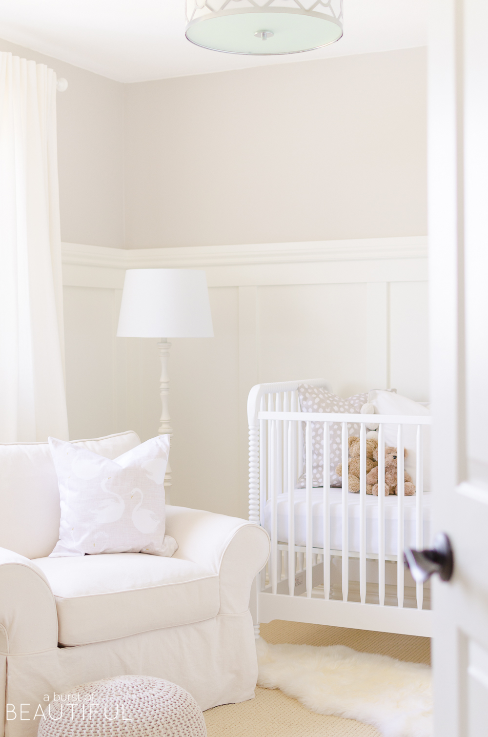
A gender neutral nursery decorated in tones of white and cream is a serene space to welcome a sweet baby girl or boy.
This post was sponsored by The Brick. All opinions and thoughts are my own, see our full disclosure policy here.
Ever since we moved our daughter out of her nursery and into her “big girl” bedroom, I had been dreaming of updating the empty space into another adorable nursery. So when we found out we were expecting again, I was ready to turn those dreams into reality and started planning right away. It was kind of a serendipitous moment as later that evening I was scrolling through Instagram and discovered The Brick had just launched an Infant and Toddler line. So straight away I started browsing their collection online and I was so happy with what I found.
They carry so many adorable products from cribs and mattresses to change tables and dressers, everything we would need to create the nursery I had been dreaming of. It seemed like the perfect match!
Now, just as we did during my first pregnancy, we decided not to find out the gender of our baby (you can read the whole story here). It was an easy decision for me the first time, but I struggled with it a bit the second time. I was really eager to design a nursery specifically for a baby girl or a baby boy. But in the end, Nick convinced me that nine months isn’t that long and I could wait it out again. And I am so glad we did!
Once we decided we weren’t finding out the gender of this baby too, I knew I would need to design another gender-neutral space (if you’re interested you can take a peek at our firstborn’s nursery reveal and the design plan). I was envisioning a nursery in white and cream with natural tones and a lot of texture. I wanted this baby’s space to feel bright and happy, while still feeling serene and soothing. So, I began collecting pieces here and there that I fell in love with and I knew would fit our design plan.
As much as I loved the design of our little one’s nursery, I still found it a little challenging to keep everything so neutral. It was after designing our daughter’s bedroom and her playroom that I realized how much I truly enjoy adding color (even if it’s just a little bit) to our home. So it became my goal to design and decorate a nursery that felt finished but would also allow us to add touches of color once our baby arrived. I loved the idea of initially designing a space that would be beautiful and functional for our new baby, but would give us the chance to update it a few months later (once we weren’t so sleep deprived!) depending if we had another girl or a baby boy.
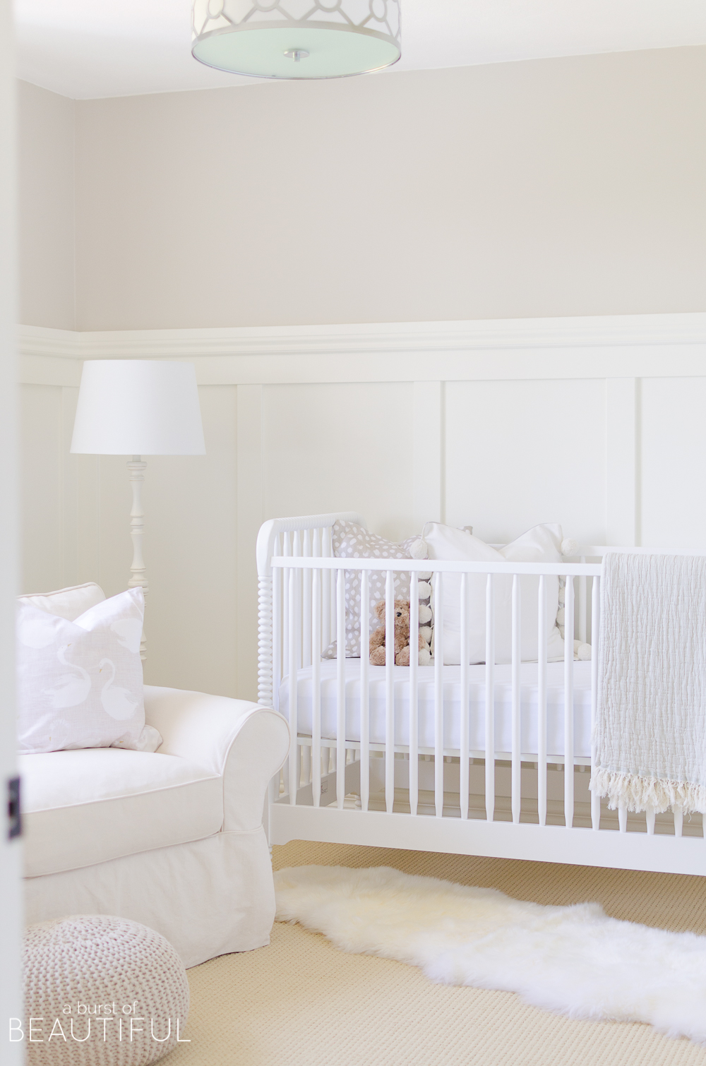
The entire design for our little one’s space started with the Rowan Valley Crib. As soon as I saw it I fell in love and I knew it would be perfect for our baby’s room. It has a classic design and timeless feel to it, which fit seamlessly with our home’s style. There are so many features I love about this crib, but my favorite has to be the wood carved spindles. They add the perfect amount of charm and interest, something we needed in this neutral space.
I love that the crib frame allows for three different mattress heights so that we can adjust the mattress to keep our little one safe and within arms reach as she grows. Speaking of mattresses, we paired our crib with the Safety 1st Peaceful Lullabies Crib and Toddler Bed Mattress so I knew our baby would be dreaming peacefully in this sweet crib until it’s time to graduate to a bed.
It’s a sturdy and durable piece that I know will stand up to life in our house and grow with our baby. I think it’s so important to choose pieces that will grow with your children, or that can be repurposed from room to room. It’s the best way to ensure you’re getting the most from your purchases, especially pieces like furniture which tend to be the most costly.
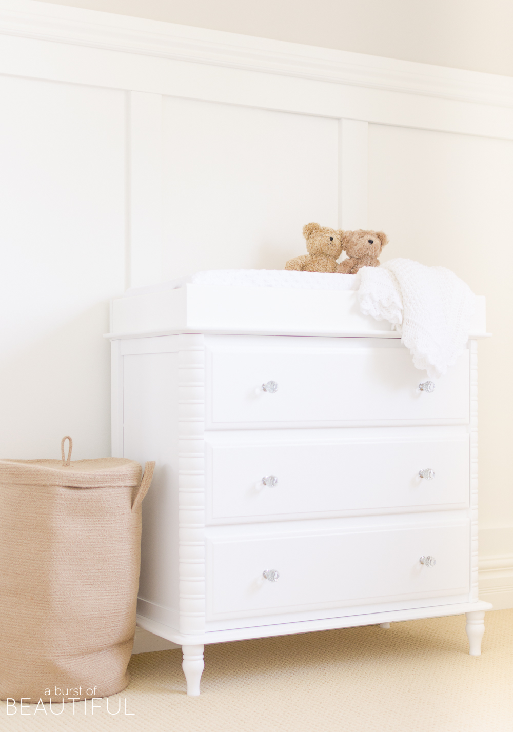
We loved the way the Rowan Valley Dresser matched so perfectly with the crib. The details on this piece are so sweet, from the spindle legs and carved mouldings to the crystal drawer pulls.
And as much as I love designing a beautiful space, we all know that’s not enough. I always take practicality and safety into consideration. And this dresser checks both of those boxes. It’s non-toxic painted surface makes cleaning those inevitable messes so easy! And steel support slides with built-in safety stops make sure little hands won’t be able to pull dresser drawers out and onto the floor (this always makes me so nervous with some of our older furniture pieces).
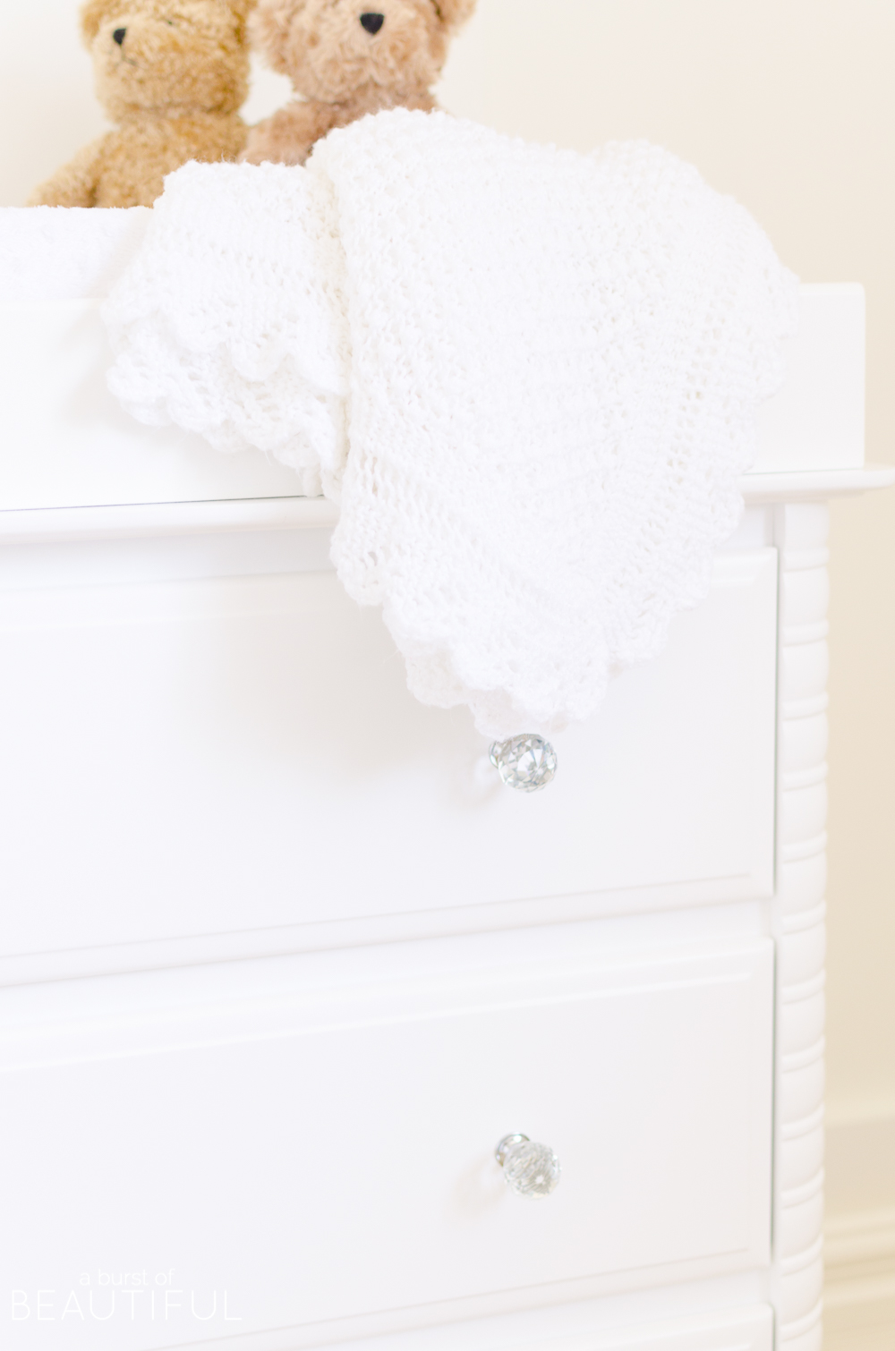
We added the Rowan Valley Changing Station Table Topper to convert this dresser to a change table while our little one is still in diapers. It’s a great addition which can easily be removed as our baby grows and we no longer need a change table.
Once I had narrowed down the furniture for the space, I started working on the details.
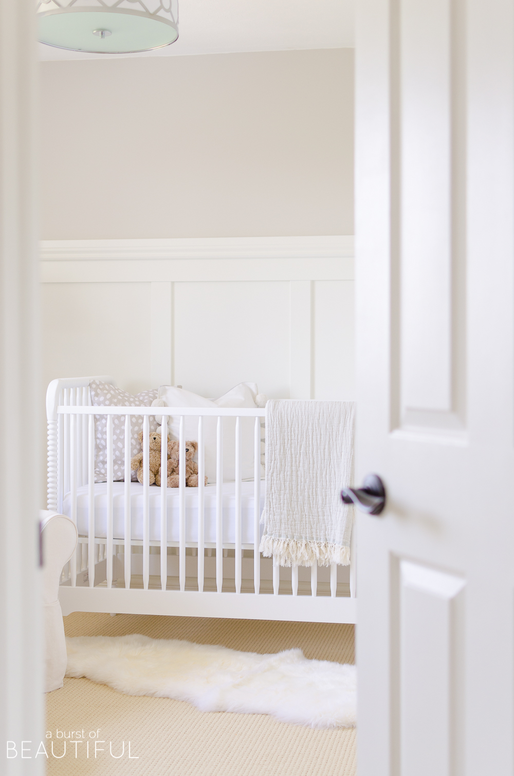
The first thing we did was install board and batten. It’s a relatively easy way to add interest and texture, something this mostly white room needed. We painted it Simply White by Benjamin Moore, and the walls got a coat of Pale Oak, also by Benjamin Moore. I love the warmth it adds, but we will likely repaint or wallpaper in the coming months.
We will be sharing a full tutorial on installing board and batten very soon!
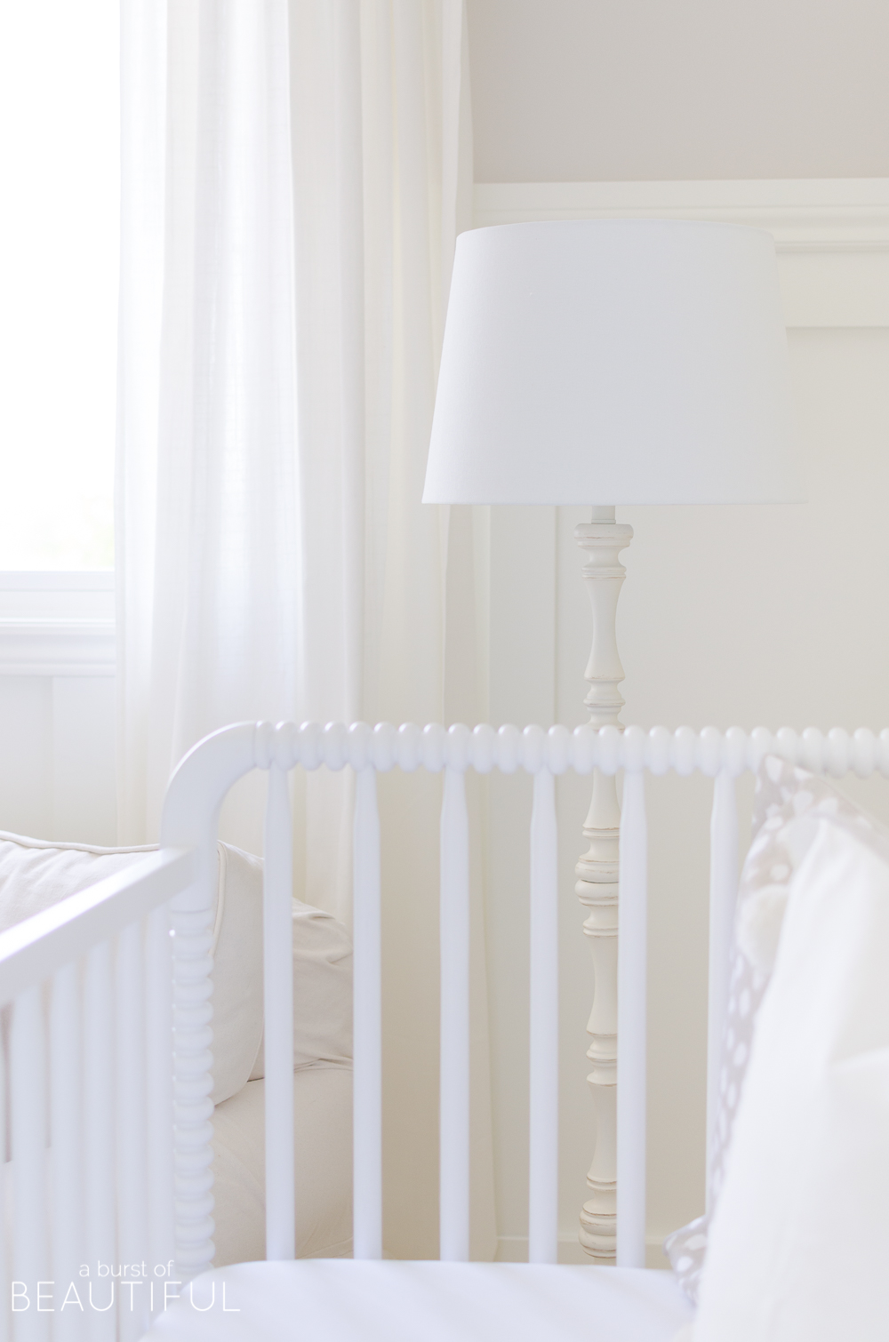
I also want to take a minute to share this simple floor lamp with a spindle base. The Megan Antique White Lamp is the perfect piece to complement the crib and change table, plus it adds a cozy glow to this corner for late-night feedings and snuggles. Again, I was thinking long-term and knew this lamp would look beautiful in a living room or bedroom when it’s no longer needed in our baby’s nursery.
Next, it was time to add a little bit of softness with textiles.
We left these simple white drapes in place for now (they are the same you see throughout our entire home). I haven’t fully committed to new window treatments and I didn’t want to rush the process. I am still deciding on a few factors, like color, pattern, and functionality.
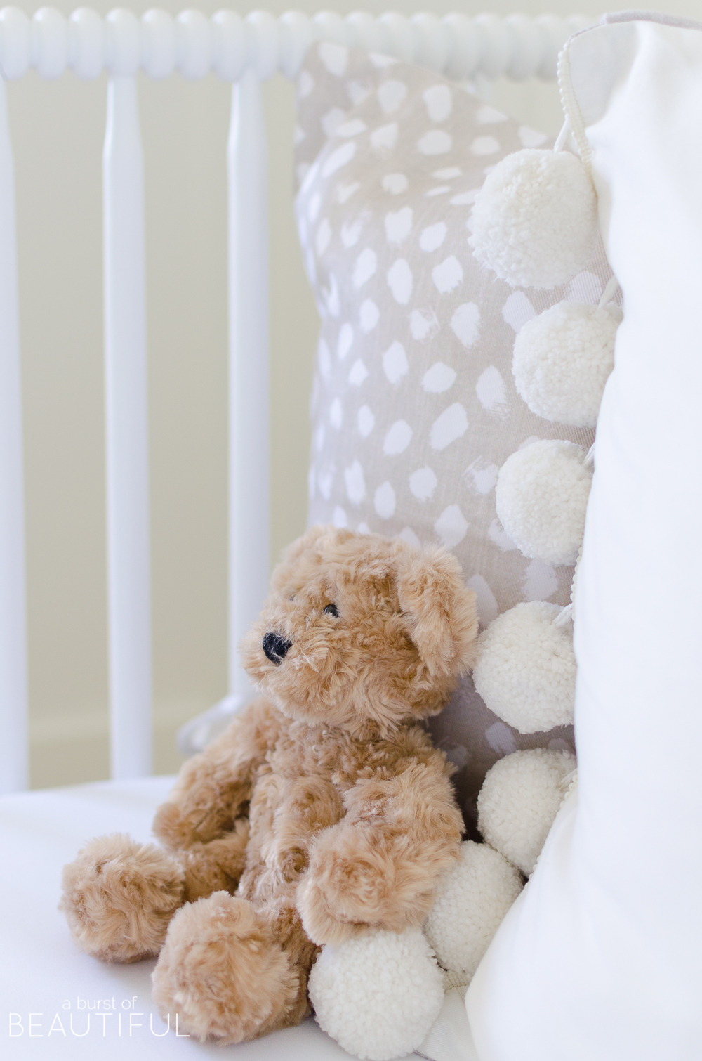
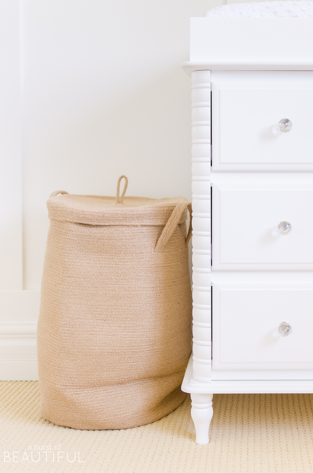
Simple accessories like pillows, rug, jute laundry basket and sweet teddies add interest and texture. A few more details like wallpaper and art will probably be added once we decide on a color palette. But for now, I absolutely love how this space has come together. It’s soft and sweet and not too busy, it’s the perfect space to welcome our new baby home.
Our little one arrived earlier than we anticipated (and before we had a chance to share our nursery reveal) if you’re interested in finding out if we had a baby girl or boy you can find out here!




Julie Blanner says
It’s so sweet and your photography is swoon worthy!
Alicia says
Julie, thank you, my sweet friend! I adore your photography, so that means a lot! xo
Karen says
Congratulations on the birth of your second beautiful daughter! The nursery is lovely, very serene. I was wondering if you could tell me the paint colors you used in your house, I’m particularly interested in the color in your living room.
Alicia says
Thank you, Karen! We are feeling very lucky to have been blessed with two sweet girls! I am working on an updated Paint Colors post for the fall since we have changed some of the colors in our home. But the coloring in our living room is called Collingwood and it is by Benjamin Moore. 🙂
Kimberly says
I love the ceiling light you used. Would you please share the source for it? If it’s in the post I’m so sorry I missed it!
Alicia says
Hi Kimberly, you didn’t miss it! I actually didn’t provide a source because we purchased it years ago from a second-hand shop. But I have found a similar option here. (affiliate link)
Sarah H says
I love the chair! Is it a Glider? I didn’t see a source for it 🙂
Alicia says
Hi Sarah,
It’s not a glider, but it’s big and comfy so it’s perfect for baby snuggles! It was originally in our living room, but we made a switch and moved it upstairs to the nursery. It’s from Joss and Main, and you can find a link for it under Shop Our Home. 🙂
Sarah H says
Thats what I thought it looked like! I loved it in your Living room as well 🙂
Alicia says
Thank you, Sarah! It really is such a comfortable chair, and it’s perfect for nursing too. 🙂