Blindsgalore, Loloi and Studio Pillows provided products for this space.
After a three-month-long remodel of our shared family cottage, we are revealing the transformation room by room. Last week we shared the kitchen and dining room, two spaces full of character and charm. Today, we are revealing our cozy cottage living room.
Our Cottage Remodel Room by Room
Kitchen
Dining Room
Living Room
Primary Bedroom
Bathroom
Bunk Room
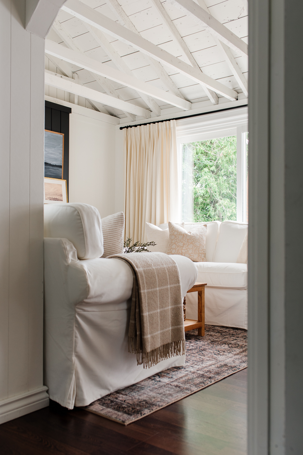
The dining room and living room are one large open-concept space, divided by a door leading to the backyard and down to the shore. The evolution of this space began just like the kitchen and dining room, with the removal of the ceiling tiles to create a bright and open space.
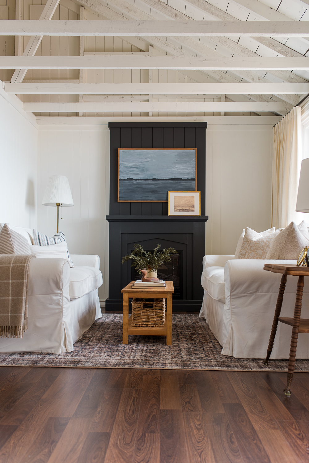


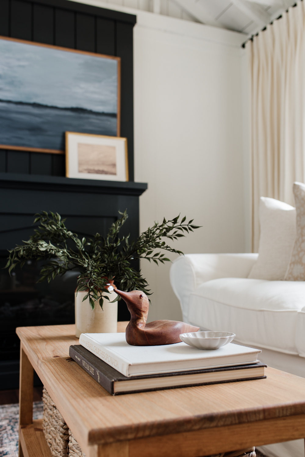
If you need a reminder, you can see what the living room used to look like here, and now we will share a closer look at the living room and all of the details that make this space feel cozy and comfortable.
The Furniture
The Loveseats
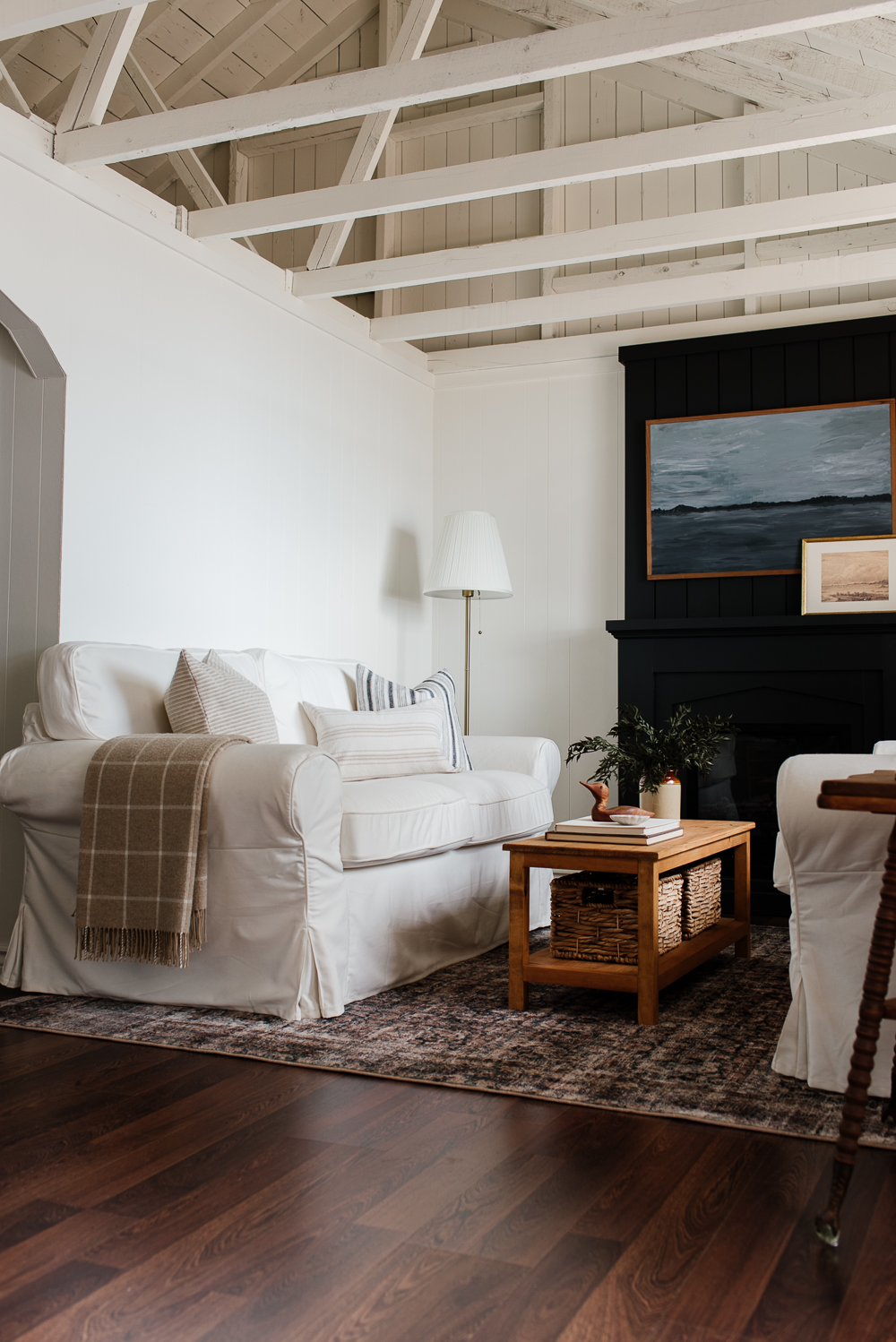
We had a hard time deciding on the best layout for the living. Just like everything about the cottage, the living room is tiny too. It’s only 10′ x 12′, which made furniture selection and placement very limited. Our goal was to maximize seating while creating a space that felt cozy and comfortable.
While we rarely spend time inside the cottage on beautiful summer days, we still wanted to maximize seating for the times we are inside. Originally our plan was to incorporate a loveseat and two armchairs and I spent hours trying to find a sofa or loveseat that was the right dimensions for this small space. I was feeling defeated when I finally came across this affordable option.
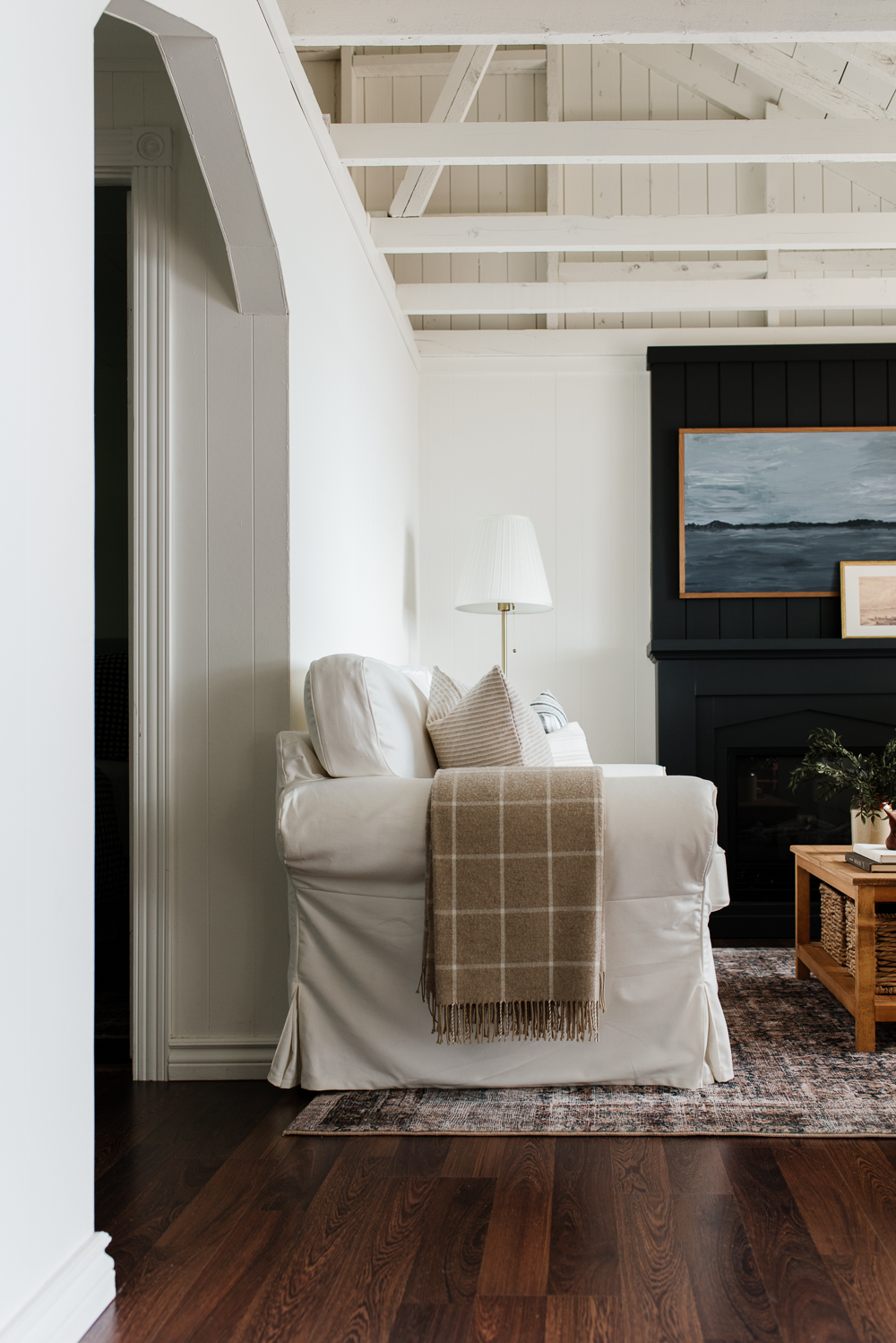
It was everything I was looking for in a sofa. It is traditional and timeless in appearance and came in a beautiful warm white material. In fact, I loved it so much that we decided to purchase two instead of a set of armchairs.
While I was creating the design plans for the cottage, I focused on pieces that were durable and easy to maintain. Even though we were creating a beautiful space, we still wanted to ensure the cottage felt carefree and relaxed. These slip-covered sofas fit the bill perfectly. They are conveniently machine washable, which means we don’t have to worry about spills and stains. We have a slipcovered sofa in our home too, and I love that I can easily remove the cover to wash it every few months.

The Coffee Table
Nick built this small-scale coffee table, which fits perfectly between the two loveseats and looks right at home in our cozy cottage living room.
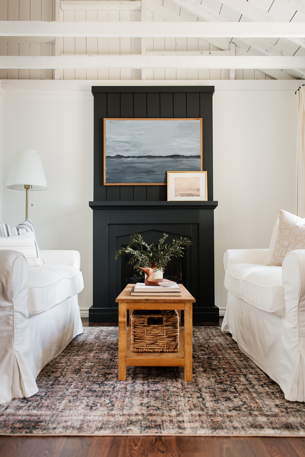
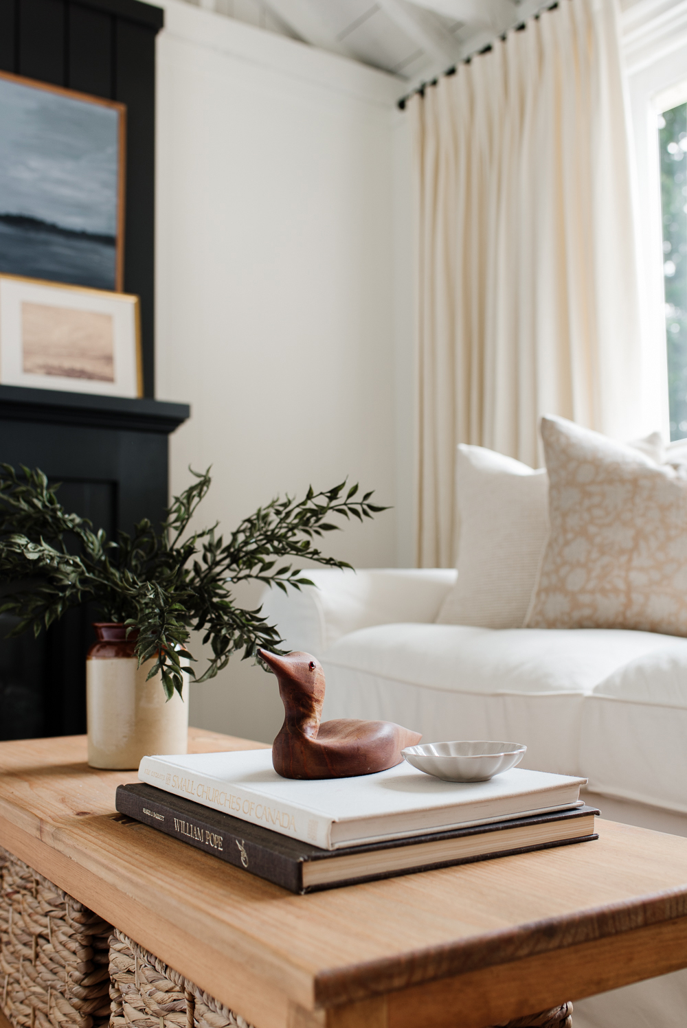
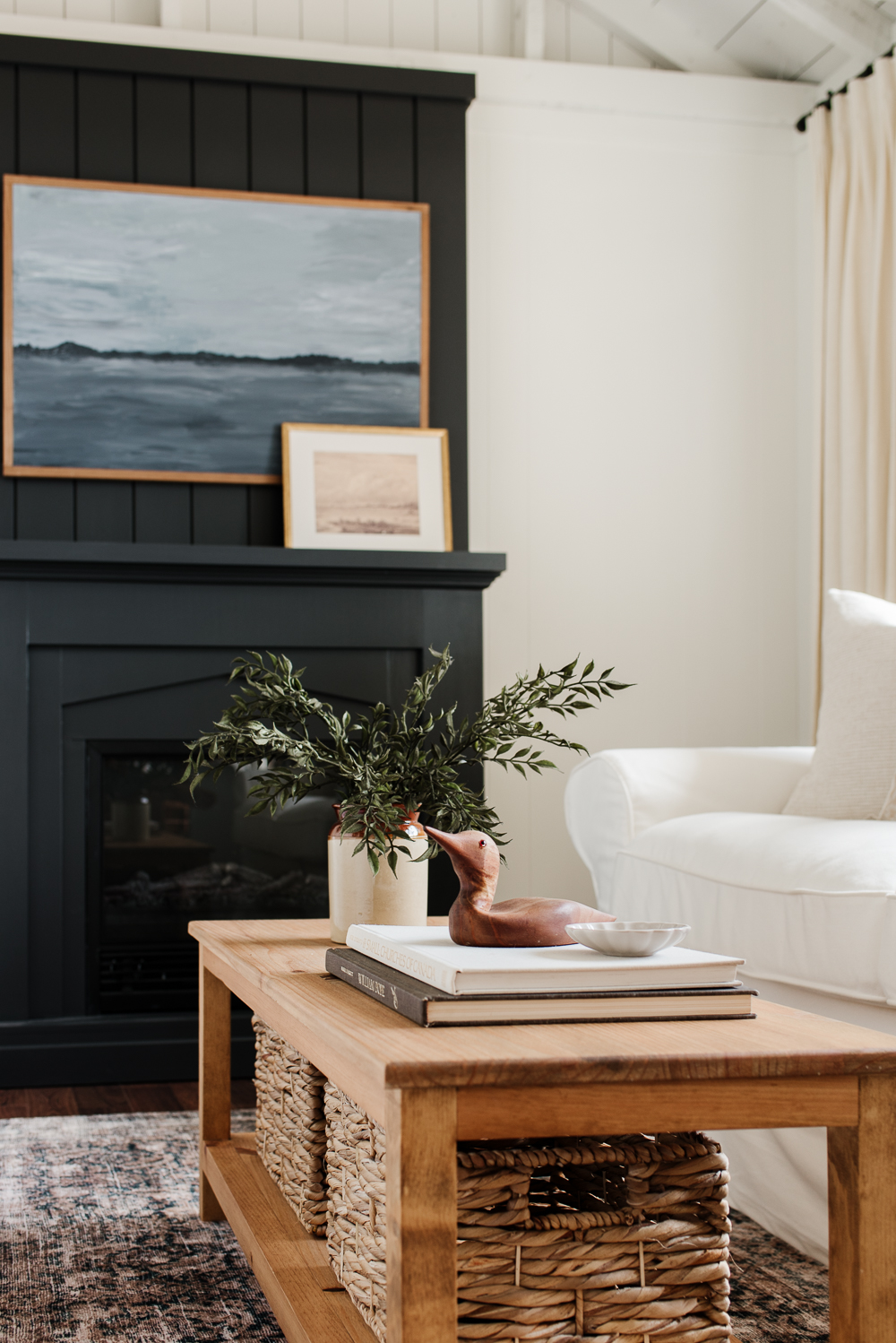
It was a quick build because it is a simple design with clean lines, and not overly complicated. Since the space between the two loveseats is very tight, we didn’t have a lot of room for a larger coffee table. This design suited the space perfectly.
Nick used his Kreg Jig 720Pro pocket hole jig, which he used to build the kitchen cabinet boxes as well as most of the furniture projects he has tackled over the years in our home. With a few inexpensive pieces of pine dimensional lumber and a laminated pine board, he built this perfectly-sized coffee table.
The reason Nick chose pine is because it is imperfect with its knots and grain patterns. It makes it less formal and feels like it could have been one of the original furniture pieces that were in the cottage. Pine is a great choice for DIY projects because of its affordability and rustic charm, especially when aiming for a more informal and cottage-like feel.
We stained it with Early American with a flat varnish. This water-based flat varnish is our go-to finish because it enhances the natural beauty of the wood while providing a durable and low-sheen finish.
If you’re interested in building this coffee table, our plans can be found on the Kreg Tool Project Plan site, which provides a step-by-step guide with measurements and instructions on how to build the coffee table.
The Sidetable
Isn’t this side table incredible?
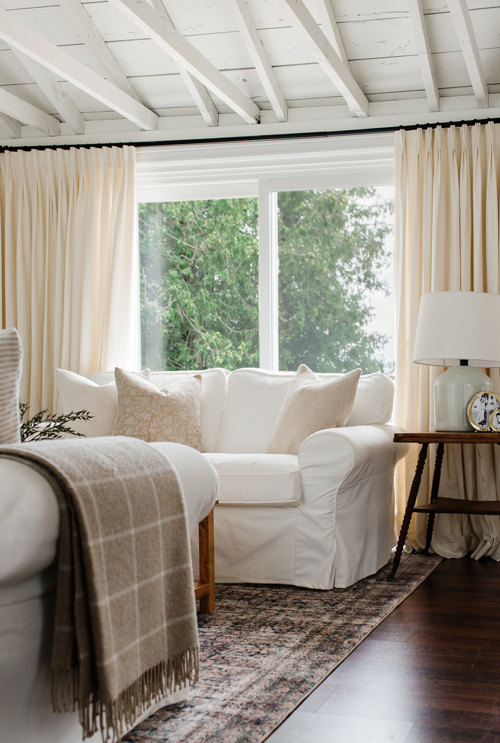
If you’ve been following our cottage remodel on Instagram, you might remember it. It was one of the last pieces we purchased for the cottage and it adds so much character to this space.
It is another piece of furniture we found through Facebook Marketplace. We actually came across it very early on in the remodelling process but held off on buying it because we were looking for a round side table, like the one we have in our living room. As we were nearing the end of our renovation we still hadn’t found what we were hoping for, so we came back to this one and I am so glad we did.
Once we purchased it Nick looked into the history and we believe it was made sometime in the late 1800s or early 1900s based on the style. If you look closely, you’ll see it has metal claw feet perched on glass balls, which were popular during that time period. It also has the most beautifully turned legs and tongue and groove detail on the tabletop.

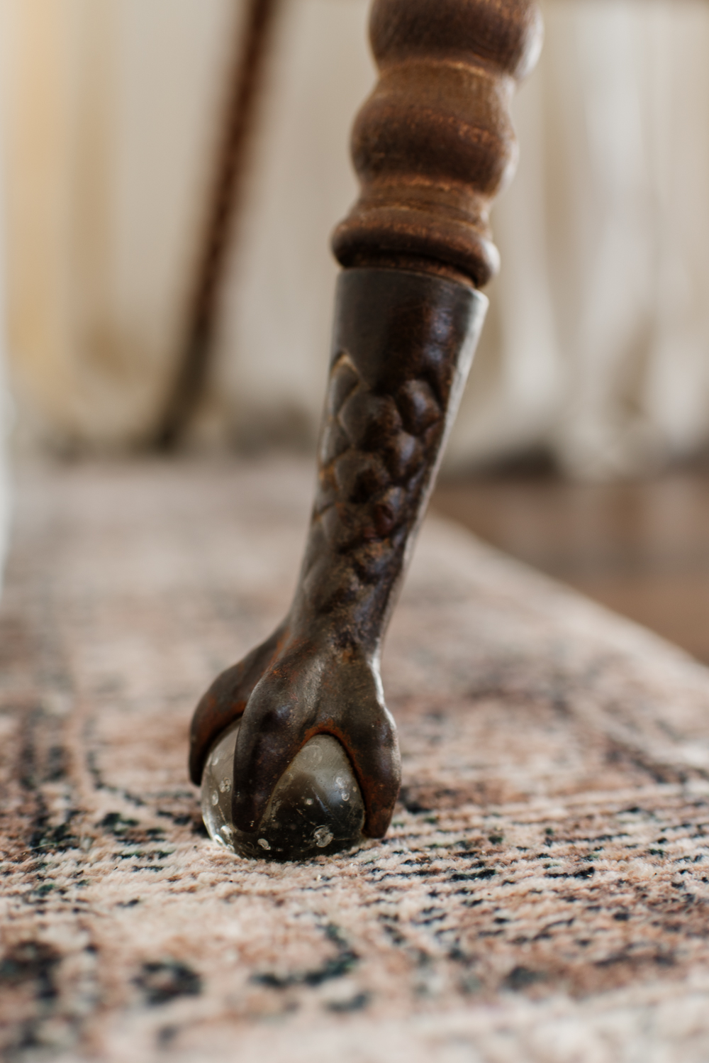
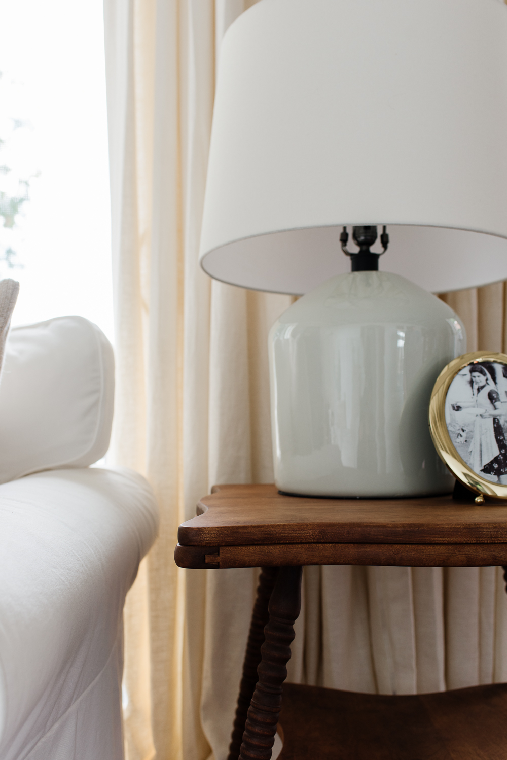
Like our antique side table at home, this table was just a bit too tall to use beside the loveseat. We debated making any changes to it as we knew the table was so old and it was beautifully crafted. In the end, we thought it would be better to make a few careful changes to infuse it with new life and many more years of use.
After stripping the table, Nick found an area in the leg pattern where he could easily make adjustments. He cut five inches of length out of each leg and re-joined them using dowels, and you can’t even see the seam. We stained it Early American and added a flat matte topcoat.
Incorporating antique pieces is such an easy way to instantly add character to any space, you can often find beautiful antique furniture at thrift stores, flea markets and on Facebook Marketplace at really reasonable prices.
The Details
The Rug
When designing a space, I usually use a beautiful rug as my inspiration. I find it helps to encourage the overall feel of the room and guides in creating a cohesive colour palette.
I came across this Amber Lewis x Loloi rug quite a while ago and knew it would be perfect for the cottage. Loloi rugs are a favourite of mine because they look like faded antique rugs but are very affordable.
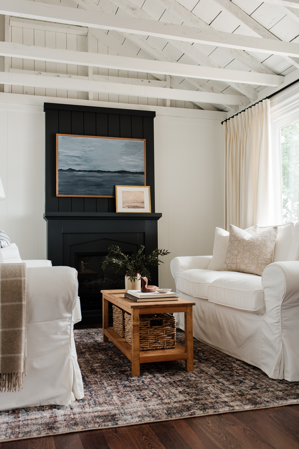
The soft, earthy tones and delicate pattern of this particular rug perfectly complement the cozy ambiance of our cottage living room, effortlessly mimicking the colours of the shore. It’s also incredibly soft and plush underfoot, but still durable enough for casual cottage living. It’s the perfect rug for infusing a bit of moody drama into any space.

The Pillows
I incorporated a mix of carefully curated pillows into the living room to help create a collected and layered look. I sourced pillows that coordinated with the colours of the rug in a variety of patterns and materials to help add interest to our white loveseats, and the space in general.
I started with three beautiful options from Studio Pillows, which is a longtime favourite shop of mine. Over the past seven years, almost all of the pillows I’ve used in our home have come from Studio Pillows, and I’ve never once been disappointed in the products or incredible customer service I’ve received. I really believe in investing in quality pieces that are timeless in design and well-made, and these pillows are the perfect example.

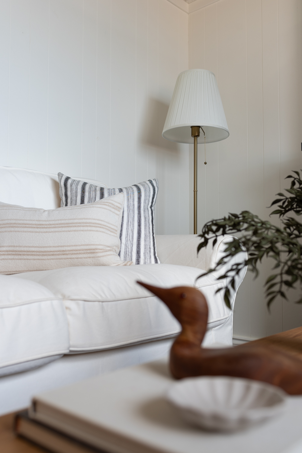
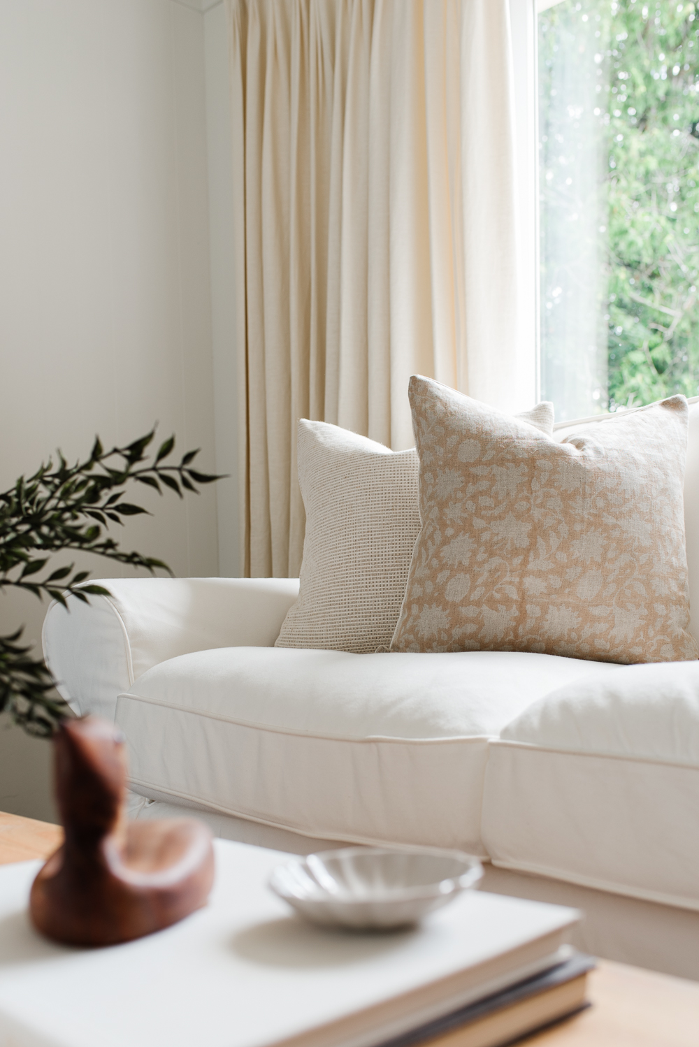
I chose a simple floral print in a soft beige colour, a textured striped grain sack lumbar and a dark navy stripe. These three pillows work so well together but are simple enough that I can separate them and use them in different spaces in the future.
I also mixed in a few simple textured pillows to help balance the patterns and used my favourite pillow inserts to create perfectly plump pillows that will always hold their shape.
The Window Treatments
Last but not least, are these beautiful custom drapes. I mentioned earlier that the living room and dining room are one large open-concept space and each room has large patio doors overlooking the shore. We framed the beautiful view with equally beautiful window treatments and we couldn’t love them more.
Made from a linen blend in a creamy shade of white they add both warmth and softness to the space while providing privacy when needed. All of the windows in our cottage are outfitted by our favourite tried and true company we’ve been using for the past seven years. I share even more details about these custom drapes here.

The Fireplace
The fireplace is definitely the focal point of the living room. Once we decided on the layout and the furniture we thought a fireplace would be a cozy element to incorporate.
We repurposed an electric fireplace that used to be in our bedroom by removing the more detailed mouldings that Nick had originally applied to it. We simplified it to give it a more modern, clean look and painted it this bold and dark colour.
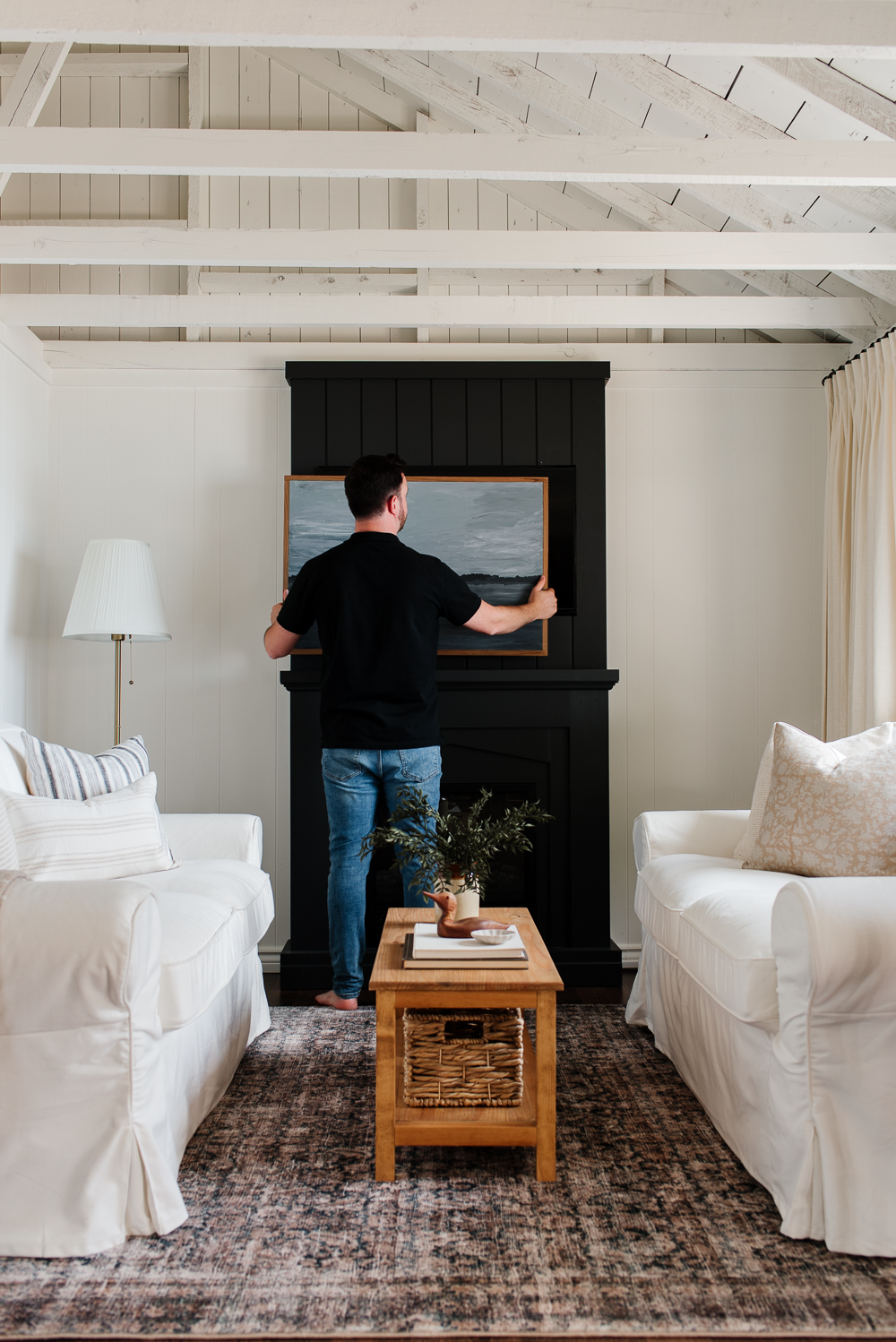

But the best part is Nick built it to conceal our TV, similar to the fireplace we have in our own home. While we are at the cottage we really try to limit screen time, but on occasion we will use the TV, especially if the weather isn’t ideal for being outdoors. When building the overmantel, Nick cut out a space for the TV to sit in. Our plan was to cover the TV with a piece of art so that the TV wasn’t the focal point.
We had an old canvas in storage, and Nick used it to paint this beautiful landscape one morning on a whim. Can you believe it? On top of everything else he can do, he’s an artist too!
It feels so great to now have this cozy living room for rainy days and chilly nights spent at the cottage. This remodel has not only enhanced the aesthetics of our cottage but also improved its functionality, offering a space where we can relax and entertain with our family and friends.
Details at a Glance
Ceiling | Simply White by Benjamin Moore
Walls | Simply White by Benjamin Moore
Trim | Simply White by Benjamin Moore
Fireplace | Wrought Iron by Benjamin Moore
Coffee Table | Provincial by Verathan
Side Table | Early American by Verathane
Pinch Pleat Drapery | Dover Snowfall by Blindsgalore
Room Sources
Rug
Coffee Table
Sofas
Pillows
Floor Lamp

Christie says
I like ve how you did the fireplace area and looks so good with the white. So cozy in this room.
Alicia says
Thank you, Christie! We love how cozy this space feels too!